Create new RichFaces Documentation Jira issue

This will launch the RichFaces Jira page - to complete your feedback please login if needed, and submit the Jira.
JBoss.orgCommunity Documentation
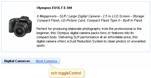
A link type control for switching between togglePanel facets. Target Panel is specified with "for" attribute. It can be located inside or outside the togglePanel. As the result of switching between facets previous facet is hidden and another one (specified with "switchToState" or panel "stateOrder" attributes) is shown.
Highly customizable look and feel
Can be located anywhere in a page layout
Switching is provided in the three modes
Server
Client
Ajax
Table 6.300. rich : toggleControl attributes
| Attribute Name |
Description

|
|---|---|
| accesskey | HTML: Access key that, when pressed, transfers focus to this element |
| action | MethodBinding pointing at the application action to be invoked, if this UIComponent is activated by you, during the Apply Request Values or Invoke Application phase of the request processing lifecycle, depending on the value of the immediate property |
| actionListener | MethodBinding pointing at method accepting an ActionEvent with return type void |
| ajaxSingle | Boolean attribute which provides possibility to limit JSF tree processing(decoding, conversion/validation, value applying) to the component which send the request only. |
| binding | JSF: The attribute takes a value-binding expression for a component property of a backing bean |
| bypassUpdates | If "true", after process validations phase skip updates of model beans an force render response. Can be used for validate components input |
| data | Serialized (on default with JSON) data passed on the client by a developer on AJAX request. It's accessible via "data.foo" syntax |
| dir | HTML: Direction indication for text that does not inherit directionality. Possible values are "LTR" (left-to-right) and "RTL" (right-to-left). |
| eventsQueue | Name of requests queue to avoid send next request before complete other from same event. Can be used to reduce number of requests of frequently events (key press, mouse move, etc.) |
| focus | ID of an element to set focus after request is completed on client side |
| for | String, which contains id (in the format of a UIComponent.findComponent() call) of the target Toggle Panel. |
| id | JSF: Every component may have a unique id that is automatically created if omitted |
| ignoreDupResponses | Attribute allows to ignore an Ajax Response produced by a request if the newest 'similar' request is in a queue already. ignoreDupResponses="true" does not cancel the request while it is processed on the server, but just allows to avoid unnecessary updates on the client side if the response isn't actual now |
| immediate | True means, that the default ActionListener should be executed immediately (i.e. during Apply Request Values phase of the request processing lifecycle), rather than waiting until the Invoke Application phase |
| lang | HTML: Code describing the language used in the generated markup for this component |
| limitToList | If "true", updates on client side ONLY elements from this 'reRender' property. if "false" (default) updates all rendered by ajax region components |
| onbeforedomupdate | The client-side script method to be called before DOM is updated |
| onblur | DHTML: The client-side script method to be called when the element loses the focus |
| onclick | DHTML: The client-side script method to be called when the element is clicked |
| oncomplete | The client-side script method to be called after the request is completed |
| ondblclick | DHTML: The client-side script method to be called when the element is double-clicked |
| onfocus | DHTML: The client-side script method to be called when the element gets the focus |
| onkeydown | DHTML: The client-side script method to be called when a key is pressed down over the element |
| onkeypress | DHTML: The client-side script method to be called when a key is pressed and released over the element |
| onkeyup | DHTML: The client-side script method to be called when a key is released over the element |
| onmousedown | DHTML: The client-side script method to be called when a mouse button is pressed down over the element |
| onmousemove | DHTML: The client-side script method to be called when a pointer is moved within the element |
| onmouseout | DHTML: The client-side script method to be called when a pointer is moved away from the element |
| onmouseover | DHTML: The client-side script method to be called when a pointer is moved onto the element |
| onmouseup | DHTML: The client-side script method to be called when a mouse button is released over the element |
| process | Id['s] (in format of call UIComponent.findComponent()) of components, processed at the phases 2-5 in case of AjaxRequest caused by this component. Can be single id, comma-separated list of Id's, or EL Expression with array or Collection |
| rendered | JSF: If "false", this component is not rendered |
| requestDelay | Attribute defines the time (in ms.) that the request will be wait in the queue before it is ready to send. When the delay time is over, the request will be sent to the server or removed if the newest 'similar' request is in a queue already |
| reRender | Id['s] (in format of call UIComponent.findComponent()) of components, rendered in case of AjaxRequest caused by this component. Can be single id, comma-separated list of Id's, or EL Expression with array or Collection |
| similarityGroupingId | If there are any component requests with identical IDs then these requests will be grouped. |
| status | ID (in format of call UIComponent.findComponent()) of Request status component |
| style | HTML: CSS style rules to be applied to the component |
| styleClass | JSF: Assigns one or more space-separated CSS class names to the component. Corresponds to the HTML "class" attribute. |
| switchToState | Contains one of the facets names where target togglePanel is switched to |
| tabindex | HTML: Position of this element in the tabbing order for the current document. This value must be an integer between 0 and 32767 |
| timeout | Response waiting time on a particular request. If a response is not received during this time, the request is aborted |
| title | HTML: Advisory title information about markup elements generated for this component |
| value | JSF: Initial value to set when rendered for the first time |
Table 6.301. Component identification parameters
| Name | Value |
|---|---|
| component-type | org.richfaces.ToggleControl |
| component-class | org.richfaces.component.html.HtmlToggleControl |
| component-family | org.richfaces.ToggleControl |
| renderer-type | org.richfaces.ToggleControlRenderer |
| tag-class | org.richfaces.taglib.ToggleControlTag |
To create the simplest variant on a page use the following syntax:
Example:
...

<rich:toggleControl for="panel"/>

        ...

       <rich:togglePanel id="panel" stateOrder="[facets order to be switched]">

                <!--Set of Facets-->

       </rich:togglePanel>

...
Example:
import org.richfaces.component.html.HtmlToggleControl;

...

HtmlToggleControl myControl = new HtmlToggleControl();

...
As it was mentioned above, the control could be in any place in layout and linked to a switching panel that is managed with "for" attribute (in the "for" attribute the full component "id" is specified according to naming containers).
The togglePanel could be also switched from the side of the control instead of being strictly defined in "switchOrder" attribute of <rich:togglePanel>.
Example:
...

<rich:togglePanel id="panel" initialState="empty" switchType="client">

        <f:facet name="first">

                <h:panelGroup>

                    <rich:toggleControl for="helloForm:panel" value="Empty" switchToState="empty"/>

                        <rich:toggleControl for="helloForm:panel" value=" Second" switchToState="second"/>

                        <!--Some content-->

                </h:panelGroup>

        </f:facet>

        <f:facet name="second">

                <h:panelGroup>

                        <rich:toggleControl for="helloForm:panel" value="Empty" switchToState="empty"/>

                        <rich:toggleControl for="helloForm:panel" value=" first" switchToState="first"/>

                        <!--Some content-->

                </h:panelGroup>

        </f:facet>

        <f:facet name="empty">

                <h:panelGroup>

                    <rich:toggleControl for="helloForm:panel" value="first" switchToState="first"/>

                        <rich:toggleControl for="helloForm:panel" value=" second" switchToState="second"/>

                </h:panelGroup>

        </f:facet>

</rich:togglePanel>

...
In this example the switching is performed on facets specified in the "switchToState" attribute.
Information about the "process" attribute usage you can find " Decide what to process " guide section.
For skinnability implementation, the components use a style class redefinition method.
To redefine the appearance of all <rich:toggleControl> components at once, you should add to your style sheets style class used by a <rich:toggleControl> component.
Table 6.302. Classes names that define a component appearance
| Class name | Description |
|---|---|
| rich-tglctrl | Defines styles for a toggle control |
In order to redefine styles for all <rich:toggleControl> components on a page using CSS, it's enough to create classes with the same names (possible classes could be found in the tables above) and define necessary properties in them.
Example:
...

.rich-tglctrl {

      font-family: monospace;

}

...
This is a result:
In the example font family was changed.
Also it's possible to change styles of particular <rich:toggleControl> component. In this case you should create own style classes and use them in corresponding <rich:toggleControl> styleClass attributes. An example is placed below:
Example:
...

.myClass {

      font-style: italic;

}

...
The "styleClass" attribute for <rich:toggleControl> is defined as it's shown in the example below:
Example:
<rich:toggleControl ... styleClass="myClass"/>
This is a result:
As it could be seen on the picture above, the font style was changed.