Documentation in development
Some concepts covered in this chapter may refer to the previous version of Richfaces, version 3.3.3. This chapter is scheduled for review to ensure all information is up to date.
Read this chapter for details on components that display messages and other feedback to the user.
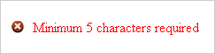
The <rich:message> component renders a single message relating to another specific component. The message consists of two parts, both of which are optional: the marker icon and the textual label. The appearance of the message can be customized, and tool-tips can be used for further information about the message.
The <rich:message> component needs the for attribute to point to the id identifier of the related component. The message is displayed depending on the state of the linked component's requests.
The <rich:message> component is automatically rendered after an Ajax request, even without the use of an <a4j:outputPanel> component.
The passedLabel attribute contains a message to display when there are no errors; that is, when validation passes successfully. The showSummary attribute specifies whether to display only a summary of the full message. The full message can be displayed in a tool-tip when hovering the mouse over the summary.
Facets are used to define the marker icons for different message states:
errorMarkerDefines the icon for messages with the
errorseverity class.fatalMarkerDefines the icon for messages with the
fatalseverity class.infoMarkerDefines the icon for messages with the
infoseverity class.passedMarkerDefines the icon for messages that are not of the
error,fatal,info, orwarnseverity classes.warnMarkerDefines the icon for messages with the
warnseverity class.
Example 14.1. rich:message example
<rich:message for="id" passedLabel="No errors" showSummary="true">

    <f:facet name="errorMarker">

        <h:graphicImage url="/image/error.png"/>

    </f:facet>

    <f:facet name="passedMarker">

        <h:graphicImage url="/image/passed.png"/>

    </f:facet>

</rich:message>
The <rich:messages> components works similarly to the <rich:message> component, but can display validation messages for a group of components instead of just a single component. Refer to Section 14.1, “<rich:message>” for details on the <rich:message> component.
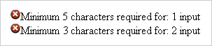
The <rich:messages> component doesn't require any extra attributes for basic usage. It displays all messages relating to requests from components in the same container element.
The <rich:message> component is automatically rendered after an Ajax request, even without the use of an <a4j:outputPanel> component.
The <rich:messages> component displays error messages for each validating component in the same container. The passedLabel attribute contains a message to display when there are no errors; that is, when validation for all components passes successfully. The layout attribute defines how the messages are presented: either using list for a list layout, or table for a tabular layout.
All messages use the same state icons, specified by using facets in the same way as for the <rich:message> component:
errorMarkerDefines the icon for messages with the
errorseverity class.fatalMarkerDefines the icon for messages with the
fatalseverity class.infoMarkerDefines the icon for messages with the
infoseverity class.passedMarkerDefines the icon for messages that are not of the
error,fatal,info, orwarnseverity classes.warnMarkerDefines the icon for messages with the
warnseverity class.
Example 14.2. rich:messages example
<h:form>

    <rich:messages passedLabel="Data validated." layout="list">

        <f:facet name="header">

            <h:outputText value="Entered Data Status:"></h:outputText>

        </f:facet>

        <f:facet name="passedMarker">

            <h:graphicImage  value="/images/ajax/passed.gif" />

        </f:facet>

        <f:facet name="errorMarker">

            <h:graphicImage value="/images/ajax/error.gif" />

        </f:facet>

    </rich:messages>


    <h:panelGrid columns="2">

        <h:outputText value="Name:" />

        <h:inputText label="Name" id="name" required="true" value="#{userBean.name}">

            <f:validateLength minimum="3"  />

        </h:inputText>

        <h:outputText value="Job:" />

        <h:inputText label="Job" id="job" required="true" value="#{userBean.job}">

            <f:validateLength minimum="3" maximum="50"  />

        </h:inputText>

        <h:outputText value="Address:" />

        <h:inputText label="Address" id="address" required="true" value="#{userBean.address}">

            <f:validateLength minimum="10" />

        </h:inputText>

        <h:outputText value="Zip:" />

        <h:inputText label="Zip" id="zip" required="true" value="#{userBean.zip}">

            <f:validateLength minimum="4" maximum="9"  />

        </h:inputText>

        <f:facet name="footer">

            <a4j:commandButton value="Validate" />

        </f:facet>

    </h:panelGrid>

</h:form>
The <rich:progressBar> component displays a progress bar to indicate the status of a process to the user. It can update either through Ajax or on the client side, and the look and feel can be fully customized.

Basic usage of the <rich:progressBar> component requires only the value attribute, which points to the method that provides the current progress.
By default, the minimum value of the progress bar is 0 and the maximum value of the progress bar is 100. These values can be customized using the minValue and maxValue attributes respectively.
The progress bar can be labeled in one of two ways:
- Using the
labelattribute The content of the
labelattribute is displayed over the progress bar.Example 14.4. Using the
labelattribute<rich:progressBar value="#{bean.incValue}" id="progrs" label="#{bean.incValue}"/>
- Using nested child components
Child components, such as the JSF
<h:outputText>component, can be nested in the<rich:progressBar>component to display over the progress bar.Example 14.5. Using nested child components
<rich:progressBar value="#{bean.incValue}">

    <h:outputText value="#{bean.incValue} %"/>

</rich:progressBar>
Macro-substitution
The following section details the use of macro-substitution paramaters in labeling. Macro-substitution may be revised and altered in future versions of RichFaces. Be aware of this when using macro-substitution in your applications.
For labeling, the <rich:progressBar> component recognizes three macro-substitution parameters:
{value}The current progress value.
{minValue}The minimum value for the progress bar.
{maxValue}The maximum value for the progress bar.
Example 14.6. Using macro-substitution for labeling
<rich:progressBar value="#{bean.incValue1}" minValue="400" maxValue="900">

    <h:outputText value="Minimum value is {minValue}, current value is {value}, maximum value is {maxValue}"/>

</rich:progressBar>
Additionally, you can use the {param} parameter to specify any custom parameters you require. Define the parameters in the bean for the progress method, then reference it with the <rich:progressBar> component's parameters attribute, as shown in Example 14.7, “Using the param parameter”.
Example 14.7. Using the param parameter
<rich:progressBar value="#{bean.incValue}" parameters="param:'#{bean.dwnlSpeed}'">

    <h:outputText value="download speed {param} KB/s"/>

</rich:progressBar>
To define customized initial and complete states for the progress bar, use the initial and complete facets. The initial facet displays when the progress value is less than or equal to the minimum value, and the complete facet displays when the progress value is greater than or equal to the maximum value.
Example 14.8. Initial and complete states
<rich:progressBar value="#{bean.incValue1}">

    <f:facet name="initial">

        <h:outputText value="Process not started"/>

    </f:facet>

    <f:facet name="complete">

        <h:outputText value="Process completed"/>

    </f:facet>

</rich:progressBar>
The <rich:progressBar> component can be set to constantly poll for updates at a constant interval. Use the interval component to set the interval in milliseconds. The progress bar is updated whenever the polled value changes. Polling is only active when the enabled attribute is set to true.
Example 14.9. Using set intervals
<rich:progressBar value="#{bean.incValue1}" id="progress" interval="900" enabled="#{bean.enabled1}"/>
The mode for updating the progress bar is determined by the mode attribute, which can have one of the following values:
ajaxThe progress bar updates in the same way as the
<a4j:poll>component. The<rich:progressBar>component repeatedly polls the server for the current progress value.clientThe progress bar updates on the client side, set using the JavaScript API.
The <rich:toolTip> component provides an informational tool-tip. The tool-tip can be attached to any control and is displayed when hovering the mouse cursor over the control.
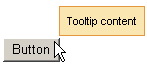
For basic usage, define the tool-tip text using the value attribute. The <rich:toolTip> component is then automatically attached to the parent element, and is usually shown when the mouse cursor hovers.
Alternatively, the content of the tool-tip can be defined inside the <rich:toolTip> tags, and the value attribute is not used. This allows HTML tags to be used to define the content, and provides for rich content such as images, links, buttons, and other RichFaces components.
Example 14.10. Defining tool-tip content
- Basic content
<rich:panel>

    <rich:toolTip value="This is a tool-tip."/>

</rich:panel>
- Rich content
<rich:panel>

    <rich:toolTip>

        This is a <b>tool-tip</b>.

    </rich:toolTip>

</rich:panel>
If not otherwise specified, the tool-tip is attached to the parent element in which it is defined. The for attribute is used to attach the tool-tip to another component, pointing to the target component's id identifier. This allows the <rich:toolTip> component to be specified outside the target element. This approach is demonstrated in Example 14.11, “Attaching the tool-tip”.
Example 14.11. Attaching the tool-tip
<rich:panel id="panelId">

...

</rich:panel>


<rich:toolTip value="This is a tool-tip." for="panelId"/>
The <rich:toolTip> component can alternatively be left unattached, and is instead invoked through an event handler on the target component. To leave the <rich:toolTip> component unattached, set attached="false", and define the event handler to trigger the tool-tip on the target component. This approach is demonstrated in Example 14.12, “Unattached tool-tips”. When leaving the <rich:toolTip> component unattached, ensure it has an id identifier defined. If the <rich:toolTip> component is nested inside the target element, it must be the last child. If it is defined outside the target element, it must be nested in an <a4j:form> component.
Example 14.12. Unattached tool-tips
<rich:panel id="panelId" onclick="#{rich:component("tooltipId")}.show(event);" />


<a4j:form>

    <rich:toolTip id="toolTipId" attached="false" value="This is a tool-tip."/>

</a4j:form>
By default, the <rich:toolTip> component is positioned intelligently based on the position of the mouse cursor. Use the direction attribute to specify a corner of the target component at which to display the tool-tip instead. Possible values include top-left, top-right, bottom-left, and bottom-right. Use the horizontalOffset and verticalOffset attributes to specify the horizontal offset and vertical offset at which to display the tool-tip.
Use the hideEvent attribute to specify when the tool-tip is hidden. The default value is none, so the tool-tip remains shown. However, it can be linked to an event on the target component, such as the mouseout event.
Set followMouse="true" to cause the tool-tip to follow the user's mouse movements.
Advanced appearance features are demonstrated in Example 14.13, “Advanced tool-tip usage”.
The mode for updating the tool-tip is determined by the mode attribute, which can have one of the following values:
ajaxThe tool-tip content is requested from the server with every activation.
clientThe tool-tip content is rendered once on the server. An external submit causes the content to re-render.
When using mode="ajax", define the defaultContent facet. The tool-tip displays the content of the defaultContent facet while loading the actual content from the server.
Example 14.13. Advanced tool-tip usage
<h:commandLink value="Simple Link" id="link">

    <rich:toolTip followMouse="true" direction="top-right" mode="ajax" value="#{bean.toolTipContent}"

                  horizontalOffset="5" verticalOffset="5" layout="block">

        <f:facet name="defaultContent">

            <f:verbatim>Loading...</f:verbatim>

        </f:facet>

    </rich:toolTip>

</h:commandLink>
The <rich:toolTip> component supports the following client-side events:
onclickThis event is activated when the tool-tip is clicked with the mouse.
ondblclickThis event is activated when the tool-tip is double-clicked with the mouse.
onmouseoutThis event is activated when the mouse cursor leaves the tool-tip.
onmousemoveThis event is activated when the mouse cursor moves over the tool-tip.
onmouseoverThis event is activated when the mouse cursor hovers over the tool-tip.
onshowThis event is activated when the tool-tip is shown.
oncompleteThis event is activated when the tool-tip is completed.
onhideThis event is activated when the tool-tip is hidden.