Documentation in development
Some concepts covered in this chapter may refer to the previous version of Richfaces, version 3.3.3. This chapter is scheduled for review to ensure all information is up to date.
Read this chapter for details on menu and toolbar components.
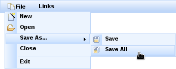
The <rich:dropDownMenu> component is used for creating a drop-down, hierarchical menu. It can be used with the <rich:toolbar> component to create menus in an application's toolbar.
The <rich:dropDownMenu> component only requires the value attribute for basic usage. Use the value attribute to define the text label that appears as the title of the menu. Clicking on the title drops the menu down.
Alternatively, use the label facet to define the menu title. If the label facet is used, the value attribute is not necessary.
To set the content of the drop-down menu and any sub-menus, use the <rich:menuItem>, <rich:menuGroup>, and <rich:menuSeparator> components. These components are detailed in Section 13.2, “Menu sub-components”.
By default, the menu drops down when the title is clicked. To drop down with a different event, use the event attribute to define the event instead.
Use the mode attribute to determine how the menu requests are submitted:
server, the default setting, submits the form normally and completely refreshes the page.ajaxperforms an Ajax form submission, and re-renders elements specified with therenderattribute.clientcauses theactionandactionListeneritems to be ignored, and the behavior is fully defined by the nested components instead of responses from submissions.
The <rich:menuItem>, <rich:menuGroup>, and <rich:menuSeparator> components are used to construct menus for the <rich:dropDownMenu> component. Refer to Section 13.1, “<rich:dropDownMenu>” for more details on the <rich:dropDownMenu> component.
The <rich:menuItem> component represents a single item in a menu control.
The <rich:menuItem> component requires the value attribute for basic usage. The value attribute is the text label for the menu item.
Icons can be added to menu items through the use of two icon attributes. The icon attribute specifies the normal icon, while the iconDisabled attribute specifies the icon for a disabled item.
Alternatively, define facets with the names icon and iconDisabled to set the icons. If facets are defined, the icon and iconDisabled attributes are ignored. Using facets for icons allows more complex usage; example shows a checkbox being used in place of an icon.
Example 13.1. Icon facets
<rich:menuItem value="Show comments">

   <f:facet name="icon">

      <h:selectBooleanCheckbox value="#{bean.property}"/>

   </f:facet>

</rich:menuItem>
Use the submitMode attribute to determine how the menu item requests are submitted:
server, the default setting, submits the form normally and completely refreshes the page.ajaxperforms an Ajax form submission, and re-renders elements specified with therenderattribute.clientcauses theactionandactionListeneritems to be ignored, and the behavior is fully defined by the nested components instead of responses from submissions.
The <rich:menuGroup> component represents an expandable sub-menu in a menu control. The <rich:menuGroup> component can contain a number of <rich:menuItem> components, or further nested <rich:menuGroup> components.
The <rich:menuGroup> component requires the value attribute for basic usage. The value attribute is the text label for the menu item.
Additionally, the <rich:menuGroup> component must contain child <rich:menuItem> components or <rich:menuGroup> components.
Icons can be added to menu groups through the use of two icon attributes. The icon attribute specifies the normal icon, while the iconDisabled attribute specifies the icon for a disabled group.
Alternatively, define facets with the names icon and iconDisabled to set the icons. If facets are defined, the icon and iconDisabled attributes are ignored.
Use the submitMode attribute to determine how the menu item requests are submitted:
server, the default setting, submits the form normally and completely refreshes the page.ajaxperforms an Ajax form submission, and re-renders elements specified with therenderattribute.clientcauses theactionandactionListeneritems to be ignored, and the behavior is fully defined by the nested components instead of responses from submissions.
The <rich:menuSeparator> component represents a separating divider in a menu control.
The <rich:menuSeparator> component does not require any attributes for basic usage. Add it as a child to a menu component to separator menu items and menu groups.
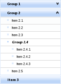
The <rich:panelMenu> component is used in conjunction with <rich:panelMenuItem> and <rich:panelMenuGroup> to create an expanding, hierarchical menu. The <rich:panelMenu> component's appearance can be highly customized, and the hierarchy can stretch to any number of sub-levels.
Example 13.2. richpanelMenu
<rich:panelMenu mode="ajax" iconGroupTopPosition="right"

                iconExpandedTopGroup="chevronUp"

                iconCollapsedTopGroup="chevronDown"

                iconExpandedGroup="disc"

                iconCollapsedGroup="disc">

   <rich:panelMenuGroup label="Group 1">

      <rich:panelMenuItem label="Item 1.1"/>

      <rich:panelMenuItem label="Item 1.2"/>

      <rich:panelMenuItem label="Item 1.3"/>

   </rich:panelMenuGroup>

   <rich:panelMenuGroup label="Group 2">

      <rich:panelMenuItem label="Item 2.1"/>

      <rich:panelMenuItem   label="Item 2.2"/>

      <rich:panelMenuItem label="Item 2.3"/>

      <rich:panelMenuGroup label="Group 2.4">

         <rich:panelMenuItem label="Item 2.4.1"/>

         <rich:panelMenuItem label="Item 2.4.2"/>

         <rich:panelMenuItem label="Item 2.4.3"/>

      </rich:panelMenuGroup>

      <rich:panelMenuItem label="Item 2.5"/>

   </rich:panelMenuGroup>

   <rich:panelMenuItem label="Item 3"/>

</rich:panelMenu>
[D]
The <rich:panelMenu> component does not need any extra attributes declared for basic usage. However, it does require child <rich:panelMenuGroup> and <rich:panelMenuItem> components. Refer to Section 13.3.6, “<rich:panelMenuGroup>” and Section 13.3.7, “<rich:panelMenuItem>” for details on these child components.
The selectedChild attribute is used to point to the name of the currently selected menu item.
By default, the event to expand the menu is a mouse click. Set the event attribute to specify a different event for expanding menus. Multiple levels of sub-menus can be expanded in one action. Set expandSingle="true" to only expand one sub-menu at a time.
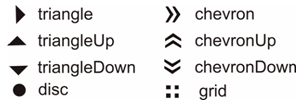
Icons for the panel menu can be chosen from a set of standard icons. There are several attributes that relate to the different menu states that the icon represents for different menu levels:
iconExpandedTopGroup,iconCollapsedTopGroup, andiconDisabledTopGroupThese attributes determine the icons for the top level menu. They relate to an expanded menu group, a collapsed menu group, and a disabled menu item respectively.
iconExpandedGroup,iconCollapsedGroup, andiconDisabledGroupThese attributes determine the icons for sub-menus that are not the top-level menu. They relate to an expanded menu group, a collapsed menu group, and a disabled menu item respectively.
Example 13.2, “richpanelMenu” demonstrates the use of icon declaration at the panel menu level. The standard icons are shown in Figure 13.2, “<Standard icons>”.
Alternatively, point the icon attributes to the paths of image files. The image files are then used as icons.
Any icons specified by child <rich:panelMenuGroup> and <rich:panelMenuItem> components overwrite the icons declared with the parent <rich:panelMenu> component.
The mode attribute defines the submission mode for normal menu items that link to content, and the expandMode attribute defines the submission mode for menu items that expand and collapse. The settings for these attributes apply to the entire menu unless a menu item defines its own individual mode or expandMode. The possible values for mode and expandMode are as follows:
server, the default setting, which submits the form normally and completely refreshes the page.ajax, which performs an Ajax form submission, and re-renders elements specified with therenderattribute.none, which causes theactionandactionListeneritems to be ignored, and the behavior is fully defined by the nested components instead of responses from submissions.
component-type:org.richfaces.PanelMenucomponent-class:org.richfaces.component.html.HtmlPanelMenucomponent-family:org.richfaces.PanelMenurenderer-type:org.richfaces.PanelMenuRenderertag-class:org.richfaces.taglib.PanelMenuTag
The <rich:panelMenuGroup> component defines a group of <rich:panelMenuItem> components inside a <rich:panelMenu>.
The <rich:panelMenuGroup> component needs the label attribute declared, which specifies the text to show for the menu entry. Additionally, the <rich:panelMenuGroup> component at least one <rich:panelMenuGroup> or <rich:panelMenuItem> components as child elements.
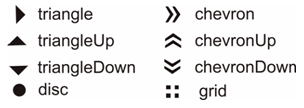
Icons for the menu group can be chosen from a set of standard icons. There are three attributes that relate to the different menu states that the icon represents: iconExpanded, iconCollapsed, and iconDisabled. The standard icons are shown in Figure 13.3, “<Standard icons>”.
Alternatively, point the icon attributes to the paths of image files. The image files are then used as icons.
Example 13.3. Using custom icons
<rich:panelMenu>

   <rich:PanelMenuGroup label="Group 1" iconExpanded="\images\img1.png" iconCollapsed="\images\img2.png">

      <!-- Nested menu components -->

   </rich:panelMenuGroup>

</rich:panelMenu>
Any icons specified by child <rich:panelMenuGroup> and <rich:panelMenuItem> components overwrite the icons declared with the parent <rich:panelMenu> component.
If the expandMode is unspecified, the submission behavior for the group is inherited from the parent <rich:panelMenu>. Otherwise, the expandMode setting is used instead of the parent's behavior.
The <rich:panelMenuItem> component represents a single item inside a <rich:panelMenuGroup> component, which is in turn part of a <rich:panelMenu> component.
The <rich:panelMenuItem> component needs the label attribute declared, which specifies the text to show for the menu entry.
Icons for menu items can be chosen from a set of standard icons. There are two attributes that relate to the different menu states that the icon represents: icon and iconDisabled. The standard icons are shown in Figure 11.1, “Basic column example”.
Alternatively, point the icon attributes to the paths of image files. The image files are then used as icons.
Example 13.4. Using custom icons
<rich:panelMenu>

   ...

      <rich:panelMenuItem value="Item 1.1" icon="\images\img1.png" iconDisabled="\images\img2.png" />

   ...

</rich:panelMenu>
Any icons specified by child <rich:panelMenuGroup> and <rich:panelMenuItem> components overwrite the icons declared with the parent <rich:panelMenu> component.
If the mode is unspecified, the submission behavior for the item is inherited from the parent <rich:panelMenu>. Otherwise, the mode setting is used instead of the parent's behavior.
The <rich:toolbar> component is a horizontal toolbar. Any JavaServer Faces (JSF) component can be added to the toolbar.

The <rich:toolbar> component does not require any attributes to be defined for basic usage. Add child components to the <rich:toolbar> component to have them appear on the toolbar when rendered.
Example 13.5. Basic usage
<rich:toolbar>

   <h:commandLink value="News" />

   <h:commandLink value="Reviews" />

   <h:commandLink value="Galleries" />

</rich:toolbar>
Set the width and height of the toolbar using the common width and height attributes.
Items on the toolbar can be separated by a graphical item separator. Use the itemSeparator attribute to specify one of the standard separator styles:


Alternatively, use the itemSeparator attribute to specify a URL to an image. The image is then used as an item separator. The appearance of the item separator can be additionally customized by using the itemSeparator facet.
Group together multiple items on the toolbar by using the <rich:toolbarGroup> child component. Refer to Section 13.4.5, “<rich:toolbarGroup>” for full details on the <rich:toolbarGroup> component.
component-type:org.richfaces.Toolbarcomponent-class:org.richfaces.component.html.HtmlToolbarcomponent-family:org.richfaces.Toolbarrenderer-type:org.richfaces.ToolbarRenderertag-class:org.richfaces.taglib.ToolbarTag
The <rich:toolbarGroup> component is a child component of the <rich:toolbar> component. The <rich:toolbarGroup> component is used to group a number of items together on a toolbar.
Like the <rich:toolbar> parent component, the <rich:toolbarGroup> component does not require any extra attributes for basic functionality. Add child components to the <rich:toolbarGroup> component to have them appear grouped on the parent toolbar when rendered.
Similar to the <rich:toolbar> component, items within a <rich:toolbarGroup> can be separated by specifying the itemSeparator attribute. Refer to Section 13.4.2, “Appearance” for details on using the itemSeparator attribute.
Groups of toolbar items can be located on either the left-hand side or the right-hand side of the parent toolbar. By default, they appear to the left. To locate the toolbar group to the right of the parent toolbar, set location="right".
Example 13.6. <rich:toolbarGroup>
<rich:toolBar height="26" itemSeparator="grid">

   <rich:toolBarGroup>

      <h:graphicImage value="/images/icons/create_doc.gif"/>

      <h:graphicImage value="/images/icons/create_folder.gif"/>

      <h:graphicImage value="/images/icons/copy.gif"/>

   </rich:toolBarGroup>

   <rich:toolBarGroup>

      <h:graphicImage value="/images/icons/save.gif"/>

      <h:graphicImage value="/images/icons/save_as.gif"/>

      <h:graphicImage value="/images/icons/save_all.gif"/>

   </rich:toolBarGroup>

   <rich:toolBarGroup location="right">

      <h:graphicImage value="/images/icons/find.gif"/>

      <h:graphicImage value="/images/icons/filter.gif"/>

   </rich:toolBarGroup>

</rich:toolBar>
The example shows how to locate a toolbar group to the right-hand side of the parent toolbar. It also demonstrates how item separators on the parent toolbar work with toolbar groups.

[D]