Documentation in development
Some concepts covered in this chapter may refer to the previous version of Richfaces, version 3.3.3. This chapter is scheduled for review to ensure all information is up to date.
This chapter details those components which act as panels and containers to hold groups of other components.
The <rich:panel> component is a bordered panel with an optional header.
No attributes need to be listed for basic usage. a <rich:panel> without any attributes defined renders a bordered region with no header.
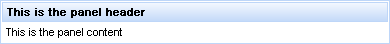
To add a header to the panel, use the header attribute to specify the text to appear in the header. Alternatively the header can be constructed using a header facet. Example 10.1, “Adding a header” demonstrates the two different approaches.
Example 10.1. Adding a header
<rich:panel header="This is the panel header">

    <h:outputText value="This is the panel content" />

</rich:panel>
<rich:panel>

    <f:facet name="header">

        <h:outputText value="This is the panel header">

    </f:facet>

    <h:outputText value="This is the panel content" />

</rich:panel>
Both the examples render an identical panel.
The <rich:accordion> is a series of panels stacked on top of each other, each collapsed such that only the header of the panel is showing. When the header of a panel is clicked, it is expanded to show the content of the panel. Clicking on a different header will collapse the previous panel and epand the selected one. Each panel contained in a <rich:accordion> component is a <rich:accordionItem> component.

The <rich:accordion> component requires no attributes for basic usage. The component can contain any number of <rich:accordionItem> components as children. The headers of the <rich:accordionItem> components control the expanding and collapsing when clicked. Only a single <rich:accordionItem> can be displayed at a time. Refer to Section 10.2.6, “<rich:accordionItem>” for details on the <rich:accordionItem> component.
The switching mode for performing submissions is determined by the switchType attribute, which can have one of the following three values:
serverThe default setting. Activation of a
<rich:accordionItem>component causes the parent<rich:accordion>component to perform a common submission, completely re-rendering the page. Only one panel at a time is uploaded to the client side.ajaxActivation of a
<rich:accordionItem>component causes the parent<rich:accordion>component to perform an Ajax form submission, and the content of the panel is rendered. Only one panel at a time is uploaded to the client side.clientActivation of a
<rich:accordionItem>component causes the parent<rich:accordion>component to update on the client side. JavaScript changes the styles such that one panel component becomes hidden while the other is shown.
In addition to the standard Ajax events and HTML events, the <rich:accordion> component uses the client-side events common to all switchable panels:
The
onitemchangeevent points to the function to perform when the switchable item is changed.The
onbeforeitemchangeevent points to the function to perform when before the switchable item is changed.
The <rich:accordion> component uses the server-side events common to all switchable panels:
The
ItemChangeEventevent occurs on the server side when an item is changed through Ajax using theservermode. It can be processed using theItemChangeListenerattribute.
component-type:org.richfaces.accordioncomponent-class:org.richfaces.component.html.HtmlAccordioncomponent-family:org.richfaces.accordionrenderer-type:org.richfaces.accordionRenderertag-class:org.richfaces.taglib.accordionTag
The <rich:accordionItem> component is a panel for use with the <rich:accordion> component.
Basic usage of the <rich:accordionItem> component requires the label attribute, which provides the text on the panel header. The panel header is all that is visible when the accordion item is collapsed.
Alternatively the header facet could be used in place of the label attribute. This would allow for additional styles and custom content to be applied to the tab.
In addition to the standard HTML events, the <rich:accordionItem> component uses the client-side events common to all switchable panel items:
The
onenterevent points to the function to perform when the mouse enters the panel.The
onleaveattribute points to the function to perform when the mouse leaves the panel.
The <rich:collapsiblePanel> component is a collapsible panel that shows or hides content when the header bar is activated. It is a simplified version of <rich:togglePanel> component.
Basic usage requires the header attribute to be specified, which provides the title for the header element. Additionally the panel requires content to display when it is expanded. Content is added as child elements like a standard panel.
The switching mode for performing submissions is determined by the switchType attribute, which can have one of the following three values:
serverThis is the default setting. The
<rich:collapsiblePanel>component performs a common submission, completely re-rendering the page. Only one panel at a time is uploaded to the client side.ajaxThe
<rich:collapsiblePanel>component performs an Ajax form submission, and only the content of the panel is rendered. Only one panel at a time is uploaded to the client side.clientThe
<rich:collapsiblePanel>component updates on the client side, re-rendering itself and any additional components listed with therenderattribute.
The appearance of the <rich:collapsiblePanel> component can be customized using facets. The headerExpanded and headerCollapsed facets are used to style the appearance of the panel when it is expanded and collapsed respectively. The expandControl facet styles the control in the panel header used for expanding, and the collapseControl facet styles the control for collapsing.
The <rich:collapsiblePanel> component uses the following unique server-side events:
The
ChangeExpandEventevent occurs on the server side when the<rich:collapsiblePanel>component is expanded or collapsed through Ajax using theservermode. It can be processed using theChangeExpandListenerattribute.
The <rich:popupPanel> component provides a pop-up panel or window that appears in front of the rest of the application. The <rich:popupPanel> component functions either as a modal window which blocks interaction with the rest of the application while active, or as a non-modal window. It can be positioned on the screen, dragged to a new position by the user, and re-sized.
The <rich:popupPanel> does not require any compulsory attributes, though certain use cases require different attributes.
If show="true" then the pop-up panel will display when the page is first loaded.
The <rich:popupPanel> component can be shown and hidden manually using the show() and hide() methods from the JavaScript API. These can be implemented using two different approaches:
Using the
<rich:componentControl>component. For details on the component, refer to Section 4.5, “<rich:componentControl>”.Using the
rich:componentfunction. For details on the function, refer to Section 17.2, “rich:component”.
For explicit referencing when using the functions, the component can be given an id identifier. The component can, however, be referenced using other means, such as through a selector.
Example 10.2, “<rich:popupPanel> example” demonstrates basic use of both the <rich:componentControl> component and the rich:component function to show and hide the <rich:popupPanel> component.
Example 10.2. <rich:popupPanel> example
<h:commandButton value="Show the panel">

    <rich:componentControl target="popup" operation="show" />

</h:commandButton>

...

<a4j:form>

    <rich:popupPanel id="popup">

        <p><a href="#" onclick="#{rich:component('popup')}.hide()">Hide the panel</a></p>

    </rich:popupPanel>

</a4j:form>
Placement
The <rich:popupPanel> component should usually be placed outside the original form, and include its own form if performing submissions. An exception to this is when using the domElementAttachment attribute, as described in Section 10.4.4, “Size and positioning”.
By default, the <rich:popupPanel> appears as a modal window that blocks interaction with the other objects on the page. To implement a non-modal window instead, set modal="false"
The pop-up panel can be both re-sized and re-positioned by the user. The minimum possible size for the panel can be set with the minWith and minHeight attributes. These abilities can be deactivated by setting resizable or movable to false as necessary.
The pop-up panel can be automatically sized when it is shown if the autosized attribute is set to true.
The <rich:popupPanel> component is usually rendered in front of any other objects on the page. This is achieved by attaching the component to the <body> element of the page, and setting a very high "z-index" (the stack order of the object). This approach is taken because relatively-positioned elements could still overlap the pop-up panel if they exist at higher levels of the DOM hierarchy, even if their z-index is less than the <rich:popupPanel> component. However, to avoid form limitation of the pop-up panel on pages where no such elements exist, the <rich:popupPanel> component can be reattached to its original DOM element by setting domElementAttachment to either parent or form.
Embedded objects inserted into the HTML with the <embed> tag will typically be rendered in front of a <rich:popupPanel> component. The <rich:popupPanel> component can be forcibly rendered in front of these objects by setting overlapEmbedObjects="true"
Using overlapEmbedObjects
Due to the additional script processing required when using the overlapEmbedObjects attribute, applications can suffer from decreased performance. As such, overlapEmbedObjects should only be set to true when <embed> tags are being used. Do not set it to true for applications that do not require it.
The <rich:popupPanel> component can contain any other rich component just like a normal panel.
Contents of the <rich:popupPanel> component which are positioned relatively may be trimmed if they extend beyond the borders of the pop-up panel. For certain in-line controls this behavior may be preferable, but for other dynamic controls it could be undesirable. If the trimOverlayedElements attribute is set to false then child components will not be trimmed if they extend beyond the borders of the pop-up panel.
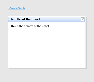
A panel header and associated controls can be added to the <rich:popupPanel> component through the use of facets. The header facet displays a title for the panel, and the controls facet can be customized to allow window controls such as a button for closing the pop-up. Example 10.3, “Header and controls” demonstrates the use of the facets.
Example 10.3. Header and controls
<h:commandLink value="Show pop-up">

    <rich:componentControl target="popup" operation="show" />

</h:commandLink>

...

<a4j:form>

    <rich:popupPanel id="popup" modal="false" autosized="true" resizeable="false">

        <f:facet name="header">

            <h:outputText value="The title of the panel" />

        </f:facet>

        <f:facet name="controls">

            <h:graphicImage value="/pages/close.png" style="cursor:pointer" onclick="#{rich:component('popup')}.hide()" />

        </f:facet>

        <p>

            This is the content of the panel.

        </p>

    </rich:popupPanel>

</a4j:form>
The <rich:tabPanel> component provides a set of tabbed panels for displaying one panel of content at a time. The tabs can be highly customized and themed. Each tab within a <rich:tabPanel> container is a <rich:tab> component. Refer to Section 10.5.5, “<rich:tab>” for further details on the <rich:tab> component.
Form elements required
All <rich:tabPanel> components should be wrapped in a form element so that the contents of the tab are processed correctly during a tab change in either ajax or server mode.
Alternatively, the contents of a <rich:tab> component within the <rich:tabPanel> component could be wrapped in a form element, such that they will be processed using the inner submitting component only. In this case, the <rich:tabPanel> component will automatically add form tags around the tab's contents, and the contents will not be processed during switching.
The activeItem attribute holds the active tab name. This name is a reference to the name identifier of the active child <rich:tab> component.
The switching mode for performing submissions is determined by the switchType attribute, which can have one of the following three values:
serverThe default setting. Activation of a
<rich:tab>component causes the parent<rich:tabPanel>component to perform a common submission, completely re-rendering the page. Only one tab at a time is uploaded to the client side.ajaxActivation of a
<rich:tab>component causes the parent<rich:tabPanel>component to perform an Ajax form submission, and the content of the tab is rendered. Only one tab at a time is uploaded to the client side.clientActivation of a
<rich:tab>component causes the parent<rich:tabPanel>component to update on the client side. JavaScript changes the styles such that one tab becomes hidden while the other is shown.
In addition to the standard Ajax events and HTML events, the <rich:tabPanel> component uses the client-side events common to all switchable panels:
The
onitemchangeevent points to the function to perform when the switchable item is changed.The
onbeforeitemchangeevent points to the function to perform when before the switchable item is changed.
The <rich:tabPanel> component uses the server-side events common to all switchable panels:
The
ItemChangeEventevent occurs on the server side when an item is changed through Ajax using theservermode. It can be processed using theItemChangeListenerattribute.
component-type:org.richfaces.tabPanelcomponent-class:org.richfaces.component.html.HtmlTabPanelcomponent-family:org.richfaces.tabPanelrenderer-type:org.richfaces.tabPanelRenderertag-class:org.richfaces.taglib.tabPanelTag
The <rich:tab> component represents an individual tab inside a <rich:tabPanel> component, including the tab's content. Clicking on the tab header will bring its corresponding content to the front of other tabs.
Basic usage of the <rich:tab> component requires the name attribute to uniquely identify the tab within the parent <rich:tabPanel> component. As the tabs are switched, the name identifier of the currently selected tab is stored in the activeItem attribute of the parent <rich:tabPanel> component.
In addition to the name identifier, the header attribute must be defined. The header attribute provides the text on the tab header. The content of the tab is then detailed inside the <rich:tab> tags.
Alternatively, the header facet could be used in place of the header attribute. This would allow for additional styles and custom content to be applied to the tab. The component also supports three facets to customize the appearance depending on the current state of the tab:
headerActivefacetThis facet is used when the tab is the currently active tab.
headerInactivefacetThis facet is used when the tab is not currently active.
headerDisabledfacetThis facet is used when the tab is disabled.
The header facet is used in place of any state-based facet that has not been defined.
The switching mode for performing submissions can be inherited from the switchType attribute of the parent <rich:tabPanel> component, or set individually for each <rich:tab> component. Refer to Section 10.5, “<rich:tabPanel>” for details on the switchType attribute.
An individual tab can be disabled by setting disabled="true"
In addition to the standard HTML events, the <rich:tab> component uses the client-side events common to all switchable panel items:
The
onenterevent points to the function to perform when the mouse enters the tab.The
onleaveattribute points to the function to perform when the mouse leaves the tab.
The <rich:togglePanel> component is a wrapper for multiple <rich:togglePanelItem> components. Each child component is displayed after being activated with the <rich:toggleControl> behavior.
Refer to Section 10.6.4, “<rich:toggleControl>” and Section 10.6, “<rich:togglePanel>” for details on how to use the components together.
The <rich:togglePanel> component is used as a base for the other switchable components, the <rich:accordion> component and the <rich:tabPanel> component. It provides an abstract switchable component without any associated markup. As such, the <rich:togglePanel> component could be customized to provide a switchable component when neither an accordion component or a tab panel component is appropriate.
The initial state of the component can be configured using the activeItem attribute, which points to a child component to display. Alternatively, if no activeItem attribute is defined, the initial state will be blank until the user activates a child component using the <rich:toggleControl> component.
The child components are shown in the order in which they are defined in the view.
The switching mode for performing submissions is determined by the switchType attribute, which can have one of the following three values:
serverThe default setting. Activation of a child component causes the parent
<rich:togglePanel>component to perform a common submission, completely re-rendering the page. Only one child at a time is uploaded to the client side.ajaxActivation of a child component causes the parent
<rich:togglePanel>component to perform an Ajax form submission, and the content of the child is rendered. Only one child at a time is uploaded to the client side.clientActivation of a child component causes the parent
<rich:togglePanel>component to update on the client side. JavaScript changes the styles such that one child component becomes hidden while the other is shown.
component-type:org.richfaces.TogglePanelcomponent-class:org.richfaces.component.html.HtmlTogglePanelcomponent-family:org.richfaces.TogglePanelrenderer-type:org.richfaces.TogglePanelRenderertag-class:org.richfaces.taglib.TogglePanelTag
The <rich:toggleControl> behavior can be attached to any interface component. It works with a <rich:togglePanel> component to switch between different <rich:togglePanelItem> components.
Refer to Section 10.6, “<rich:togglePanel>” and Section 10.6.5, “<rich:togglePanelItem>” for details on how to use the components together.
The <rich:toggleControl> can be used to switch through <rich:togglePanelItem> components in a <rich:togglePanel> container. If the <rich:toggleControl> component is positioned inside a <rich:togglePanel> component, no attributes need to be defined, as the control is assumed to switch through the <rich:togglePanelItem> components of its parent.
A <rich:toggleControl> component can be located outside the <rich:togglePanel> component it needs to switch. Where this is the case, the <rich:togglePanel> is identified using the activePanel attribute. the Cycling through components requires the for attribute, which points to the id identifier of the <rich:togglePanel> that it controls.
The <rich:toggleControl> component will cycle through <rich:togglePanelItem> components in the order they are defined within the view. However, the next item to switch to can be explicitly defined by including a <rich:toggleControl> component within a <rich:togglePanelItem> and using the targetItem attribute. The targetItem attribute points to the <rich:togglePanelItem> to switch to when the state is next changed. Example 10.4, “<rich:toggleControl> example” demonstrates how to specify the next switchable state in this way.
Example 10.4. <rich:toggleControl> example
<rich:togglePanel id="layout" activeItem="short">

     <rich:togglePanelItem id="short">

          //content

          <h:commandButton>

               <rich:toggleControl targetItem="details"> // switches to details state

          </h:commandButton>

     </rich:togglePanelItem>

     <rich:togglePanelItem id="details">

          //content

          <h:commandButton>

               <rich:toggleControl targetItem="short"> //switches to short state

          </h:commandButton>

     <rich:togglePanelItem>

</rich:togglePanel>

<h:commandButton>

     <rich:toggleControl activePanel="layout"/> // cycles through the states

</h:commandButton>
The <rich:togglePanelItem> component is a switchable panel for use with the <rich:togglePanel> component. Switching between <rich:togglePanelItem> components is handled by the <rich:toggleControl> behavior.