Documentation in development
Some concepts covered in this chapter may refer to the previous version of Richfaces, version 3.3.3. This chapter is scheduled for review to ensure all information is up to date.
This chapter covers all components related to the display of tables and grids.
The <a4j:repeat> component is used to iterate changes through a repeated collection of components. It allows specific rows of items to be updated without sending Ajax requests for the entire collection. The <a4j:repeat> component forms the basis for many of the tabular components detailed in Chapter 11, Tables and grids.
The contents of the collection are determined using Expression Language (EL). The data model for the contents is specified with the value attribute. The var attribute names the object to use when iterating through the collection. This object is then referenced in the relevant child components. Example 11.1, “<a4j:repeat> example” shows how to use <a4j:repeat> to maintain a simple table.
Example 11.1. <a4j:repeat> example
<table>

    <tbody>

        <a4j:repeat value="#{repeatBean.items}" var="item">

            <tr>

                <td><h:outputText value="#{item.code}" id="item1" /></td>

                <td><h:outputText value="#{item.price}" id="item2" /></td>

            </tr>

        </a4j:repeat>

    </tbody>

</table>
Each row of a table contains two cells: one showing the item code, and the other showing the item price. The table is generated by iterating through items in the repeatBeans.items data model.
The <a4j:repeat> component uses other attributes common to iteration components, such as the first attribute for specifying the first item for iteration, and the rows attribute for specifying the number of rows of items to display.
Specific cells, rows, and columns can be updated without sending Ajax requests for the entire collection. Components that cause the change can specify which part of the table to update through the render attribute. The render attribute specifies which part of a table to update:
render=cellIdUpdate the cell with an identifier of
cellIdwithin the row that contains the current component.Instead of a specific identifier, the
cellIdreference could be a variable:render=#{bean.cellToUpdate}render=tableId:rowIdUpdate the row with an identifier of
rowIdwithin the table with an identifier oftableId. Alternatively, if the current component is contained within the table, userender=rowIdInstead of a specific identifier, the
tableIdofrowIdreferences could be variables:render=tableId:#{bean.rowToUpdate}render=tableId:rowId:cellIdUpdate the cell with an identifier of
cellId, within the row with and identifier ofrowId, within the table with an identifier oftableId.Instead of a specific identifier, any of the references could be variables:
render=tableId:#{bean.rowToUpdate}:cellId
Alternatively, keywords can be used with the render attribute:
render=@columnUpdate the column that contains the current component.
render=@rowUpdate the row that contains the current component.
render=tableId:@bodyUpdate the body of the table with the identifier of
tableId. Alternatively, if the current component is contained within the table, userender=@bodyrender=tableId:@headerUpdate the header of the table with the identifier of
tableId. Alternatively, if the current component is contained within the table, userender=@headerrender=tableId:@footerUpdate the footer of the table with the identifier of
tableId. Alternatively, if the current component is contained within the table, userender=@footer
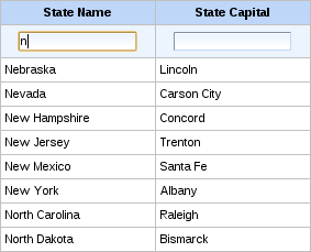
The <rich:column> component facilitates columns in a table. It supports merging columns and rows, sorting, filtering, and customized skinning.
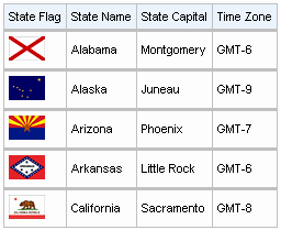
In general usage, the <rich:column> component is used in the same was as the JavaServer Faces (JSF) <h:column> component. It requires no extra attributes for basic usage, as shown in Example 11.2, “Basic column example”.
Example 11.2. Basic column example
<rich:dataTable value="#{capitalsBean.capitals}" var="cap" rows="5">

    <rich:column>

        <f:facet name="header">State Flag</f:facet>

        <h:graphicImage value="#{cap.stateFlag}"/>

    </rich:column>

    <rich:column>

        <f:facet name="header">State Name</f:facet>

        <h:outputText value="#{cap.state}"/>

    </rich:column>

    <rich:column >

        <f:facet name="header">State Capital</f:facet>

        <h:outputText value="#{cap.name}"/>

    </rich:column>

    <rich:column>

        <f:facet name="header">Time Zone</f:facet>

        <h:outputText value="#{cap.timeZone}"/>

    </rich:column>

</rich:dataTable>
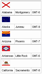
Columns can be merged by using the colspan attribute to specify how many normal columns to span. The colspan attribute is used in conjunction with the breakBefore attribute on the next column to determine how the merged columns are laid out. Example 11.3, “Column spanning example”.
Example 11.3. Column spanning example
<rich:dataTable value="#{capitalsBean.capitals}" var="cap" rows="5">

    <rich:column colspan="3">

        <h:graphicImage value="#{cap.stateFlag}"/>

    </rich:column>

    <rich:column breakBefore="true">

        <h:outputText value="#{cap.state}"/>

    </rich:column>

    <rich:column >

        <h:outputText value="#{cap.name}"/>

    </rich:column>

    <rich:column>

        <h:outputText value="#{cap.timeZone}"/>

    </rich:column>

</rich:dataTable>
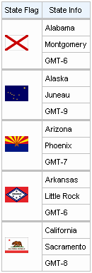
Similarly, the rowspan attribute can be used to merge and span rows. Again the breakBefore attribute needs to be used on related <rich:column> components to define the layout. Example 11.4, “Row spanning example” and the resulting Figure 11.4, “Complex headers using column groups” show the first column of the table spanning three rows.
Example 11.4. Row spanning example
<rich:dataTable value="#{capitalsBean.capitals}" var="cap" rows="5">

    <rich:column rowspan="3">

        <f:facet name="header">State Flag</f:facet>

        <h:graphicImage value="#{cap.stateFlag}"/>

    </rich:column>

    <rich:column>

        <f:facet name="header">State Info</f:facet>

        <h:outputText value="#{cap.state}"/>

    </rich:column>

    <rich:column breakBefore="true">

        <h:outputText value="#{cap.name}"/>

    </rich:column>

    <rich:column breakBefore="true">

        <h:outputText value="#{cap.timeZone}"/>

    </rich:column>

</rich:dataTable>
For details on filtering and sorting columns, refer to Section 11.8, “Table filtering” and Section 11.9, “Table sorting”.
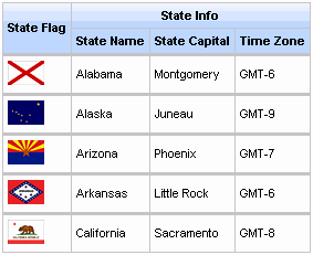
The <rich:columnGroup> component combines multiple columns in a single row to organize complex parts of a table. The resulting effect is similar to using the breakBefore attribute of the <rich:column> component, but is clearer and easier to follow in the source code.
The <rich:columnGroup> can also be used to create complex headers in a table. Example 11.5, “Complex headers using column groups” and the resulting Figure 11.4, “Complex headers using column groups” demonstrate how complex headers can be achieved.
Example 11.5. Complex headers using column groups
<rich:dataTable value="#{capitalsBean.capitals}" var="cap" rows="5" id="sublist">

    <f:facet name="header">

        <rich:columnGroup>

            <rich:column rowspan="2">

                <h:outputText value="State Flag"/>

            </rich:column>

            <rich:column colspan="3">

                <h:outputText value="State Info"/>

            </rich:column>

            <rich:column breakBefore="true">

                <h:outputText value="State Name"/>

            </rich:column>

            <rich:column>

                <h:outputText value="State Capital"/>

            </rich:column>

            <rich:column>

                <h:outputText value="Time Zone"/>

            </rich:column>

        </rich:columnGroup>

    </f:facet>

    <rich:column>

        <h:graphicImage value="#{cap.stateFlag}"/>

    </rich:column>

    <rich:column>

        <h:outputText value="#{cap.state}"/>

    </rich:column>

    <rich:column>

        <h:outputText value="#{cap.name}"/>

    </rich:column>

    <rich:column>

        <h:outputText value="#{cap.timeZone}"/>

    </rich:column>

</rich:dataTable>
The <rich:dataGrid> component is used to arrange data objects in a grid. Values in the grid can be updated dynamically from the data model, and Ajax updates can be limited to specific rows. The component supports header, footer, and caption facets.
The <rich:dataGrid> component is similar in function to the JavaServer Faces <h:panelGrid> component. However, the <rich:dataGrid> component additionally allows iteration through the data model rather than just aligning child components in a grid layout.
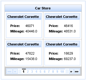
The <rich:dataGrid> component requires the value attribute, which points to the data model, and the var attribute, which holds the current variable for the collection of data.
The number of columns for the grid is specifed with the columns attribute, and the number of elements to layout among the columns is determined with the elements attribute. The first attribute references the zero-based element in the data model from which the grid starts.
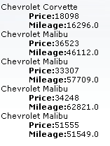
Example 11.6. <rich:dataGrid> example
<rich:panel style="width:150px;height:200px;">

  <h:form>

    <rich:dataGrid value="#{dataTableScrollerBean.allCars}" var="car" columns="2" elements="4" first="1">

        <f:facet name="header">

          <h:outputText value="Car Store"></h:outputText>

      </f:facet>

      <rich:panel>

          <f:facet name="header">

            <h:outputText value="#{car.make} #{car.model}"></h:outputText>

          </f:facet>

          <h:panelGrid columns="2">

            <h:outputText value="Price:" styleClass="label"></h:outputText>

            <h:outputText value="#{car.price}"/>

            <h:outputText value="Mileage:" styleClass="label"></h:outputText>

            <h:outputText value="#{car.mileage}"/>

          </h:panelGrid>

      </rich:panel>

      <f:facet name="footer">

          <rich:datascroller></rich:datascroller>

      </f:facet>

    </rich:dataGrid>

  </h:form>

</rich:panel>
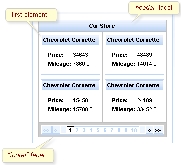
As <rich:dataGrid> the component is based on the <a4j:repeat> component, it can be partially updated with Ajax. Refer to Section 11.1.2, “Limited views and partial updates” for details on partially updating the <rich:dataGrid> component.
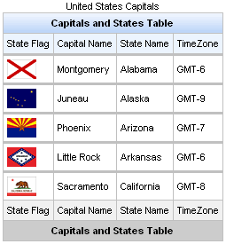
The <rich:dataTable> component is used to render a table, including the table's header and footer. It works in conjunction with the <rich:column> and <rich:columnGroup> components to list the contents of a data model.
<rich:extendedDataTable>
The <rich:dataTable> component does not include extended table features, such as data scrolling, row selection, and column reordering. These features are available as part of the <rich:extendedDataTable> component; refer to Section 11.6, “<rich:extendedDataTable>” for further details.
The value attribute points to the data model, and the var attribute specifies a variable to use when iterating through the data model.
The first attribute specifies which item in the data model to start from, and the rows attribute specifies the number of items to list. The header, footer, and caption facets can be used to display text, and to customize the appearance of the table through skinning. demonstrates a simple table implementation.
Example 11.7. <rich:dataTable> example
<rich:dataTable value="#{capitalsBean.capitals}" var="cap" rows="5">

    <f:facet name="caption">

        <h:outputText value="United States Capitals" />

    </f:facet>

    <f:facet name="header">

        <h:outputText value="Capitals and States Table" />

    </f:facet>

    <rich:column>

        <f:facet name="header">State Flag</f:facet>

            <h:graphicImage value="#{cap.stateFlag}"/>

        <f:facet name="footer">State Flag</f:facet>

    </rich:column>

    <rich:column>

        <f:facet name="header">State Name</f:facet>

            <h:outputText value="#{cap.state}"/>

        <f:facet name="footer">State Name</f:facet>

    </rich:column>

    <rich:column >

        <f:facet name="header">State Capital</f:facet>

            <h:outputText value="#{cap.name}"/>

        <f:facet name="footer">State Capital</f:facet>

    </rich:column>

    <rich:column>

        <f:facet name="header">Time Zone</f:facet>

            <h:outputText value="#{cap.timeZone}"/>

        <f:facet name="footer">Time Zone</f:facet>

    </rich:column>

    <f:facet name="footer">

        <h:outputText value="Capitals and States Table" />

    </f:facet>

</rich:dataTable>
For details on filtering and sorting data tables, refer to Section 11.8, “Table filtering” and Section 11.9, “Table sorting”.
As <rich:dataTable> the component is based on the <a4j:repeat> component, it can be partially updated with Ajax. Refer to Section 11.1.2, “Limited views and partial updates” for details on partially updating the <rich:dataTable> component.
component-type:org.richfaces.DataTablecomponent-class:org.richfaces.component.html.HtmlDataTablecomponent-family:org.richfaces.DataTablerenderer-type:org.richfaces.DataTableRenderertag-class:org.richfaces.taglib.DataTableTag
Table 11.1. Style classes (selectors) with corresponding skin parameters
| Class (selector) name | Skin Parameters | CSS properties mapped | |
|---|---|---|---|
| tableBackgroundColor | background-color | |
| generalSizeFont | font-size | |
generalTextColor | color | ||
generalFamilyFont | font-family | ||
| headerBackgroundColor | background-color | |
| headerBackgroundColor | background-color | |
| tableBorderWidth, tableBorderColor | border-right, border-bottom | |
headerTextColor | color | ||
headerWeightFont | font-weight | ||
generalSizeFont | font-size | ||
generalFamilyFont | font-family | ||
| additionalBackgroundColor | background-color | |
| tableBorderWidth, tableBorderColor | border-bottom | |
| tableBorderWidth, tableBorderColor | border-right | |
generalTextColor | color | ||
generalSizeFont | font-size | ||
generalFamilyFont | font-family | ||
| tableFooterBackgroundColor | background-color | |
| tableFooterBackgroundColor | background-color | |
| tableBorderWidth, tableBorderColor | border-right, border-bottom | |
generalTextColor | color | ||
headerWeightFont | font-weight | ||
generalSizeFont | font-size | ||
generalFamilyFont | font-family | ||
| tableSubfooterBackgroundColor | background-color | |
| tableBorderWidth, tableBorderColor | border-right, border-bottom | |
generalTextColor | color | ||
generalSizeFont | font-size | ||
generalFamilyFont | font-family |
Style classes (selectors) without skin parameters
.rich-table-captionThis class defines styles for a "caption" facet element.
.rich-table-rowThis class defines styles for a table row.
.rich-table-firstrowThis class defines styles for a table's first row.
The <rich:extendedDataTable> component builds on the functionality of the <rich:dataTable> component, adding features such as data scrolling, row and column selection, and rearranging of columns.
The <rich:extendedDataTable> component includes the following attributes not included in the <rich:dataTable> component:
frozenColumns | onselectionchange | selectionMode |
height | selectedClass | tableState |
noDataLabel | selection |
The <rich:extendedDataTable> component does not include the following attributes available with the <rich:dataTable> component:
columnscolumnsWidth
Basic use of the <rich:extendedDataTable> component requires the value and var attributes, the same as with the <rich:dataTable> component. Refer to Section 11.5, “<rich:dataTable>” for details.
The height attribute defines the height of the table on the page. This is set to 100% by default. The width of the table can be set by using the width attribute. As with the <rich:dataTable> component, the look of the <rich:extendedDataTable> component can be customized and skinned using the header, footer, and caption facets.
Example 11.8. <rich:extendedDataTable> example
<rich:extendedDataTable id="edt" value="#{extendedDT.dataModel}" var="edt" width="500px" height="500px" selectedClass="dataTableSelectedRow" sortMode="single" selectionMode="multi" selection="#{extendedDT.selection}" rowKeyVar="rkvar" tableState="#{extendedDT.tableState}">

    <rich:column id="id" headerClass="dataTableHeader" width="50" label="Id" sortable="true" sortBy="#{edt.id}" sortIconAscending="dataTableAscIcon" sortIconDescending="dataTableDescIcon">

        <f:facet name="header">

            <h:outputText value="Id" />

        </f:facet>

        <h:outputText value="#{edt.id}" />

    </rich:column>

    <rich:column id="name" width="300" headerClass="dataTableHeader" label="Name" sortable="true" sortBy="#{edt.name}" sortIconAscending="dataTableAscIcon" sortIconDescending="dataTableDescIcon" filterBy="#{edt.name}" filterEvent="onkeyup" visible="false">

        <f:facet name="header">

            <h:outputText value="Name" />

        </f:facet>

        <h:outputText value="#{edt.name}" />

    </rich:column>

    <rich:column id="date" width="100" headerClass="dataTableHeader" label="Date" sortable="true" comparator="#{extendedDT.dateComparator}" sortIconAscending="dataTableAscIcon" sortIconDescending="dataTableDescIcon">

        <f:facet name="header">

            <h:outputText value="Date" />

        </f:facet>

        <h:outputText value="#{edt.date}"><f:convertDateTime pattern="yyyy-MM-dd HH:mm:ss" />

        </h:outputText>

    </rich:column>

    <rich:column id="group" width="50" headerClass="dataTableHeader" label="Group" sortable="true" sortBy="#{edt.group}" sortIconAscending="dataTableAscIcon" sortIconDescending="dataTableDescIcon">

        <f:facet name="header">

            <h:outputText value="Group" />

        </f:facet>

        <h:outputText value="#{edt.group}" />

    </rich:column>

</rich:extendedDataTable>
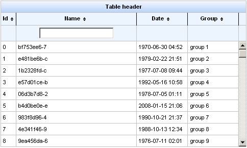
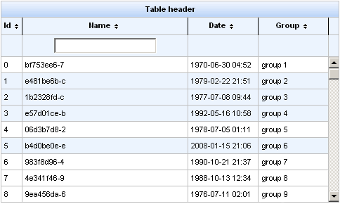
Example 11.8, “<rich:extendedDataTable> example” shows an example extended data table. The implementation features a scrolling data table, selection of one or more rows, sorting by columns, grouping by column, and a filter on the Name column.
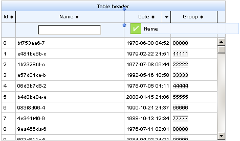
Row selection is determined by the selectionMode attribute. Setting the attribute to none allows for no row selection capability. Setting the selectionMode attribute to single allows the user to select a single row at a time using the mouse. With the selectionMode attribute set to multi, the user can select multiple rows by holding down the Shift or Ctrl keys while clicking. The selection attribute points to the object that tracks which rows are selected. Figure 11.9, “Selecting multiple rows” shows the table from the example with multiple rows selected.
A user can type their criteria into the text field to customize the filter of the column below. For full details on filtering tables, refer to Section 11.8, “Table filtering”.
Each column can be used to sort the contents of the table. The value of the data model to sort by is specified with the sortBy attribute. Columns can be quickly sorted either ascending or descending by clicking on the directional icon next to the column title. The directional icons are defined in each <rich:column> component with the sortIconAscending and sortIconDescending attributes, for ascending and descending icons respectively. For full details on sorting tables, refer to Section 11.9, “Table sorting”.
Columns in a <rich:extendedDataTable> component can be rearranged by the user by dragging each column to a different position. The label attribute for the <rich:column> component is displayed during dragging, as shown in
Once the contents of the table have been rearranged and customized by the user, the tableState attribute can be used to preserve the customization so it can be restored later. The tableState attribute points to a backing-bean property which can in turn be saved to a database separate from standard JSF state-saving mechanisms.
The <rich:list> component renders a list of items. The list can be an numerically ordered list, an unordered bullet-point list, or a data definition list. The component uses a data model for managing the list items, which can be updated dynamically.
The var attribute names a variable for iterating through the items in the data model. The items to iterate through are determined with the value attribute by using EL (Expression Lanugage).
By default, the list is displayed as an unordered bullet-point list. The type attribute is used to specify different list types:
unorderedThe default presentation. The list is presented as a series of bullet-points, similar to the
<ul>HTML element.orderedThe list is presented as a numbered series of items, similar to the
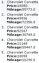
<ol>HTML element.definitionsThe list is presented as a series of data definitions. Part of the data model, specified as the term, is listed prominently. The other associated data is listed after each term.
The term is marked using the
termfacet. The facet is required for all definition lists. Use of the facet is shown in Example 11.9, “Data definition list”.Example 11.9. Data definition list
<h:form>

    <rich:list var="car" value="#{dataTableScrollerBean.allCars}" type="definitions" rows="5" title="Cars">

        <f:facet name="term">

            <h:outputText value="#{car.make} #{car.model}"></h:outputText>

        </f:facet>

        <h:outputText value="Price:" styleClass="label"></h:outputText>

        <h:outputText value="#{car.price}" /><br/>

        <h:outputText value="Mileage:" styleClass="label"></h:outputText>

        <h:outputText value="#{car.mileage}" /><br/>

    </rich:list>

</h:form>
The appearance of bullet points for unordered lists or numeration for ordered lists can be customized through CSS, using the list-style-type property.
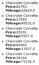
The first attribute specifies which item in the data model to start from, and the rows attribute specifies the number of items to list. The title attribute is used for a floating tool-tip. Example 11.10, “<rich:list> example” shows a simple example using the <rich:list> component.
Example 11.10. <rich:list> example
<h:form>

    <rich:list var="car" value="#{dataTableScrollerBean.allCars}" rows="5" type="unordered" title="Car Store">

        <h:outputText value="#{car.make} #{car.model}"/><br/>

        <h:outputText value="Price:" styleClass="label"></h:outputText>

        <h:outputText value="#{car.price} "/><br/>

        <h:outputText value="Mileage:" styleClass="label"></h:outputText>

        <h:outputText value="#{car.mileage} "/><br/>

    </rich:list>

</h:form>
Documentation in development
This section is currently under development. Any features it describes may not be available in the current release of RichFaces.
Tables entries can be filtered by the user through either the basic method built in to the <rich:column> component, or by defining external filters. Refer to Section 11.2, “<rich:column>” for details on using the <rich:column> component in tables.
The built-in filtering abilities of the <rich:column> component allow the user to enter text as a filtering value. The table displays only those entries that begin with the filter value.
Set the filterValue attribute to point to the value used to filter the column. This can be either an initial filtering value on the page, or a value binding on the server. The filterValue value is then used with the JavaScript startsWith() method to filter the column entries based on the data specified with the filterBy attribute. Expressions in the filterBy attribute must refer to the variable declared in the table's var attribute, which is used to fill the contents of the table.
The filter is processed and the table is rendered when the onblur event occurs for the column. This can be changed by defining a different event with the filterEvent attribute. For example, to implement live updating such that the filter refreshes after every keystroke, set filterEvent="onkeyup".
Example 11.11. Basic filtering
<rich:dataTable value="#{capitalsBean.capitals}" var="cap">

   <f:facet name="header">

      <rich:column>

         <h:outputText value="State Name">

      </rich:column>

      <rich:column>

         <h:outputText value="State Capital">

      </rich:column>

   </f:facet>

   <rich:column filterValue="#{capitalsBean.currentStateFilterValue}"

                filterBy="#{cap.state}" filterEvent="onkeyup">

      <h:outputText value="#{cap.state}"/>

   </rich:column>

   <rich:column filterValue="#{capitalsBean.currentNameFilterValue}"

                filterBy="#{cap.name}" filterEvent="onkeyup">

      <h:outputText value="#{cap.name}"/>

   </rich:column>

</rich:dataTable>
The example uses the basic filtering method on both columns in the table.
[D]
If you require more advanced filtering using custom functions or expressions, use the external filtering properties of the <rich:column> component.
Use the filterExpression attribute to define an expression that can be evaluated as a boolean value. The expression checks if each table entry satisfies the filtering condition when the table is rendered.
Use the filterMethod attribute to define a method binding. The method needs to accept an object as a parameter and return a boolean value. Similar to the filterExpression attribute, the table is rendered only with those entries that satisfy the filtering condition. By defining a custom filtering method, you can implement complex business logic to filter a table.
Example 11.12. External filtering
<rich:dataTable value="#{capitalsBean.capitals}" var="cap" id="table">

   <f:facet name="header">

      <rich:column>

         <h:outputText value="State Name">

      </rich:column>

      <rich:column>

         <h:outputText value="State Time Zone">

      </rich:column>

   </f:facet>

   <rich:column filterMethod="#{filteringBean.filterStates}">

        <f:facet name="header">

            <h:inputText value="#{filteringBean.filterValue}" id="input">

                <a4j:ajax event="onkeyup" render="table"

                              ignoreDupResponses="true" requestDelay="700"/>

            </h:inputText>

        </f:facet>

      <h:outputText value="#{cap.state}"/>

   </rich:column>

   <rich:column filterExpression=

      "#{fn:containsIgnoreCase(cap.timeZone, filteringBean.filterZone)}">

        <f:facet name="header">

            <h:selectOneMenu value="#{filteringBean.filterZone}">

                <f:selectItems value="#{filteringBean.filterZones}" />

                <a4j:ajax event="onchange" render="table" />

            </h:selectOneMenu>

        </f:facet>

      <h:outputText value="#{cap.timeZone}"/>

   </rich:column>

</rich:dataTable>
The example uses a filter expression on the first column and a filter method on the second column.

[D]
Documentation in development
This section is currently under development. Any features it describes may not be available in the current release of RichFaces.
Tables entries can be sorted by the user through either the basic method built in to the <rich:column> component, or by defining external sorting algorithms. Refer to Section 11.2, “<rich:column>” for details on using the <rich:column> component in tables.
Sorting non-English tables
To sort a table whose contents are not in English, add the org.richfaces.datatableUsesViewLocale context parameter to the project's web.xml settings file. Set the value of the context parameter to true.
The built-in sorting functionality of the <rich:column> component allows a user to click the header of a column to sort it in ascending or descending order.
Set the sortBy attribute to indicate which value to use when sorting the column. Expressions in the sortBy attribute must refer to the variable declared in the table's var attribute, which is used to fill the contents of the table.
Example 11.13. Basic sorting
<rich:dataTable value="#{capitalsBean.capitals}" var="cap" width="300px">

   <rich:column sortBy="#{cap.state}">

      <f:facet name="header">

         <h:outputText value="State Name"/>

      </f:facet>

      <h:outputText value="#{cap.state}"/>

   </rich:column>

   <rich:column sortBy="#{cap.name}">

      <f:facet name="header">

         <h:outputText value="State Capital"/>

      </f:facet>

      <h:outputText value="#{cap.name}"/>

   </rich:column>

</rich:dataTable>
The example uses the basic sorting method on both columns in the table.

[D]
Use the sortOrder attribute to set how the table's contents are sorted when it is first loaded. By default, the value of the sortOrder attribute is unsorted, so that table entries appear in the order the are contained in the data model. Use sortOrder="ascending" to sort the entries in ascending alphabetical or numerical order. Use sortOrder="descending" to sort the entries in descending alphabetical or numerical order. The sortOrder attribute can also be used to externally set the sort order of a table when using the external sorting method; refer to Section 11.9.2, “External sorting” for details.
Use the sortMode attribute to determine how multiple columns are sorted. By default, the value of the sortMode attribute is single, so tables are only sorted by a single column. Each time the header of a column is clicked the entire table is re-sorted according to that column. Set sortMode="multiple" to allow tables to be sorted by a primary column, then by a secondary column, and so on.
If you require more advanced sorting using custom functions or expressions, use the external sorting properties of the <rich:column> component.
Deactivate the built-in sorting by setting selfSorted="false" for the <rich:column> component. You can then bind the sortOrder attribute to bean properties and manage the sorting order externally.
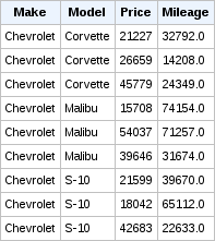
Example 11.14. External sorting
<rich:dataTable value="#{dataTableScrollerBean.allCars}"

                var="category" rows="20" id="table" reRender="ds2"

                sortPriority="#{sortingBean.prioritList}">

   <rich:column id="make" sortBy="#{category.make}"

                sortOrder="#{sortingBean.makeDirection}" selfSorted="false">

      <f:facet name="header">

         <h:outputText styleClass="headerText" value="Make" />

      </f:facet>

      <h:outputText value="#{category.make}" />

   </rich:column>

   <rich:column id="model" sortBy="#{category.model}"

                sortOrder="#{sortingBean.modelDirection}" selfSorted="false">

      <f:facet name="header">

         <h:outputText styleClass="headerText" value="Model" />

      </f:facet>

      <h:outputText value="#{category.model}" />

   </rich:column>

   <rich:column id="price" sortBy="#{category.price}"

                sortOrder="#{sortingBean.priceDirection}" selfSorted="false">

      <f:facet name="header">

         <h:outputText styleClass="headerText" value="Price" />

      </f:facet>

      <h:outputText value="#{category.price}" />

   </rich:column>

   <rich:column id="mileage" sortBy="#{category.mileage}"

                sortOrder="#{sortingBean.mileageDirection}" selfSorted="false">

      <f:facet name="header">

         <h:outputText styleClass="headerText" value="Mileage" />

      </f:facet>

      <h:outputText value="#{category.mileage}" />

   </rich:column>

</rich:dataTable>
The example uses an external control to manage the table's sorting.
[D]
When using the sortMode="multiple" configuration, set the priority by which columns are sorted with the sortPriorities attribute.
Use the sortExpression attribute to define a bean property to use for sorting the column. The expression checks each table entry against the sorting expression during rendering.