Create new RichFaces Documentation Jira issue

This will launch the RichFaces Jira page - to complete your feedback please login if needed, and submit the Jira.
JBoss.orgCommunity Documentation
panelBar is used for grouping any content which is loaded on the client side and appears as groups divided on child panels after the header is clicked.
Table 6.223. rich : panelBar attributes
| Attribute Name |
Description

|
|---|---|
| binding | JSF: The attribute takes a value-binding expression for a component property of a backing bean |
| contentClass | Assigns one or more space-separated CSS class names to the component content |
| contentStyle | CSS style rules to be applied to the component content |
| headerClass | Assigns one or more space-separated CSS class names to the component header |
| headerClassActive | Assigns one or more space-separated CSS class names to the header of the active component item |
| headerStyle | CSS style rules to be applied to the component header |
| headerStyleActive | CSS style rules to be applied to the header of the active component item |
| height | The height of the slide panel. Might be defined as pixels or as percentage. Default value is "100%". |
| id | JSF: Every component may have a unique id that is automatically created if omitted |
| immediate | A flag indicating that this component value must be converted and validated immediately (that is, during Apply Request Values phase), rather than waiting until a Process Validations phase |
| onclick | DHTML: The client-side script method to be called when a panel bar is clicked |
| onitemchange | The client-side script method to be called when a panel bar item is changed |
| onmousemove | DHTML: The client-side script method to be called when a pointer is moved within the component |
| onmouseout | DHTML: The client-side script method to be called when a pointer is moved away from the component |
| onmouseover | DHTML: The client-side script method to be called when a pointer is moved onto the component |
| rendered | JSF: If "false", this component is not rendered |
| selectedPanel | Attribure defines name of selected item |
| style | HTML: CSS style rules to be applied to the component |
| styleClass | JSF: Assigns one or more space-separated CSS class names to the component. Corresponds to the HTML "class" attribute. |
| value | JSF: The current value of this component |
| valueChangeListener | JSF: Listener for value changes |
| width | HTML: The width of the slide panel. Might be defined as pixels or as percentage. Default value is "100%". |
Table 6.224. Component identification parameters
| Name | Value |
|---|---|
| component-type | org.richfaces.PanelBar |
| component-class | org.richfaces.component.html.HtmlPanelBar |
| component-family | org.richfaces.PanelBar |
| renderer-type | org.richfaces.PanelBarRenderer |
| tag-class | org.richfaces.taglib.PanelBarTag |
To create the simplest variant on a page use the following syntax:
Example:
...
<rich:panelBar>
...
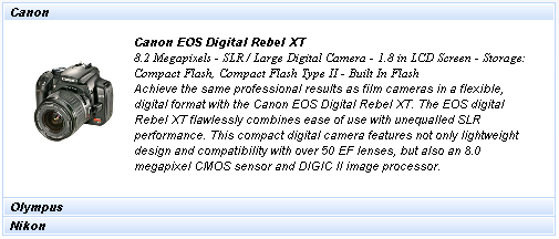
<rich:panelBarItem label="Canon">
...
</rich:panelBarItem>
<rich:panelBarItem label="Nikon">
...
</rich:panelBarItem>
</rich:panelBar>
...
Example:
import org.richfaces.component.html.HtmlPanelBar;

...

HtmlPanelBar myBar = new HtmlPanelBar();

...
As it was mentioned above, panelBar is used for grouping any content on the client, thus its customization deals only with specification of sizes and styles for rendering.
"width" and "height" (both are 100% on default) attributes stand apart.
Style attributes are described further.
panelBar could contain any number of child panelBarItem components inside, which content is uploaded onto the client and headers are controls to open the corresponding child element.
For skinnability implementation, the components use a style class redefinition method. Default style classes are mapped on skin parameters.
There are two ways to redefine the appearance of all <rich:panelBar> components at once:
Redefine the corresponding skin parameters
Add to your style sheets style classes used by a <rich:panelBar> component
Table 6.225. Skin parameter redefinition for a whole component
| Skin parameter | CSS properties |
|---|---|
| headerBackgroundColor | border-color |
There is one predefined class for the <rich:panelBar> , which is applicable to a whole component, specifying padding, borders, and etc.
Table 6.226. Class name that define a component appearance
| Class name | Class description |
|---|---|
| rich-panelbar | Defines styles for a wrapper <div> element of a component |
Other classes responsible for elements rendering are described for child <rich:panelBarItem> elements and could be found in the components chapters.
Table 6.227. Style component classes
| A class attribute | A component element defined by an attribute |
|---|---|
| styleClass | Applicable to a whole component (together with headers) |
| headerClass | Applicable to a header element |
| contentClass | Applicable to a content |
In order to redefine styles for all <rich:panelBar> components on a page using CSS, it's enough to create classes with the same names (possible classes could be found in the tables above) and define necessary properties in them.
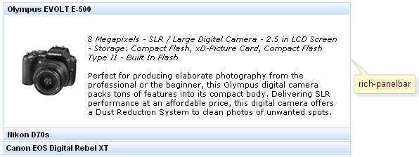
Example:
...

.rich-panelbar{

        font-style: italic;

}

...
This is a result:
In the example header and content font style was changed.
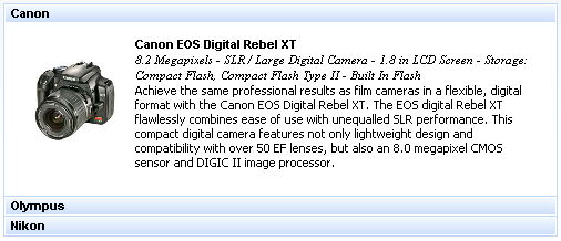
Also it's possible to change styles of particular <rich:panelBar> component. In this case you should create own style classes and use them in corresponding <rich:panelBar> styleClass attributes. An example is placed below:
Example:
...

.myClass{

       font-family: Tahoma;

}

...
The "contentClass" attribute for <rich:panelBar> is defined as it's shown in the example below:
Example:
<rich:panelBar ... contentClass="myClass"/>
This is a result:
As it could be seen on the picture above, the font family for content were changed.
On the component LiveDemo page you can see the example of <rich:panelBar> usage and sources for the given example.