Create new RichFaces Documentation Jira issue

This will launch the RichFaces Jira page - to complete your feedback please login if needed, and submit the Jira.
JBoss.orgCommunity Documentation
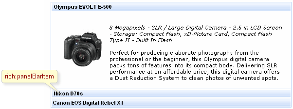
panelBarItem is used for grouping any content inside within one panelBar which is loaded on client side and appears as groups divided on child panels after header is clicked.
Table 6.228. rich : panelBarItem attributes
| Attribute Name |
Description

|
|---|---|
| binding | JSF: The attribute takes a value-binding expression for a component property of a backing bean |
| contentClass | Assigns one or more space-separated CSS class names to the component content |
| contentStyle | CSS style rules to be applied to the component content |
| headerClass | Assigns one or more space-separated CSS class names to the component header |
| headerClassActive | Assigns one or more space-separated CSS class names to the header of the active item |
| headerStyle | CSS style rules to be applied to the component header |
| headerStyleActive | CSS style rules to be applied to the header of the active item |
| id | JSF: Every component may have a unique id that is automatically created if omitted |
| label | Label text appears on a panel item header. Default value is "auto generated label" |
| name | Attribute defines item name. Default value is "getId()". |
| onenter | The client-side script method to be called when a panel bar item is opened |
| onleave | The client-side script method to be called when a panel bar item is leaved |
| rendered | JSF: If "false", this component is not rendered |
Table 6.229. Component identification parameters
| Name | Value |
|---|---|
| component-type | org.richfaces.PanelBarItem |
| component-class | org.richfaces.component.html.HtmlPanelBarItem |
| component-family | org.richfaces.PanelBarItem |
| renderer-type | org.richfaces.PanelBarItemRenderer |
| tag-class | org.richfaces.taglib.PanelBarItemTag |
To create the simplest variant on a page use the following syntax:
Example:
...

<rich:panelBar>

        <rich:panelBarItem label="Canon">

                ...

        </rich:panelBarItem>

        <rich:panelBarItem label="Nikon">

                ...

        </rich:panelBarItem>

</rich:panelBar>

...
Example:
import org.richfaces.component.html.HtmlPanelBarItem;

...

HtmlPanelBarItem myBarItem = new HtmlPanelBarItem();

...
The "label" attribute defines text to be represented. If you can use the "label" facet, you can even not use the "label" attribute.
Example:
...

<rich:panelBarItem...>

        <f:facet name="label">

                <h:graphicImage value="/images/img1.png"/>

        </f:facet>

        ...

       <!--Any Content inside-->

        ...

</rich:panelBarItem>

...
As it was mentioned above, panelBarItem is used for grouping any content inside within one panelBar, thus its customization deals only with specification of sizes and styles for rendering.
panelBar could contain any number of child panelBarItem components inside, which content is uploaded onto the client and headers are controls to open the corresponding child element.
For skinnability implementation, the components use a style class redefinition method. Default style classes are mapped on skin parameters.
There are two ways to redefine the appearance of all <rich:panelBarItem> components at once:
Redefine the corresponding skin parameters
Add to your style sheets style classes used by a <rich:panelBarItem> component
Table 6.231. Skin parameters redefinition for a content
| Skin parameters | CSS properties |
|---|---|
| generalTextColor | color |
| preferableDataSizeFont | font-size |
| preferableDataFamilyFont | font-family |
Table 6.232. Skin parameters redefinition for a header element (active or inactive)
| Skin parameters | CSS properties |
|---|---|
| headerTextColor | color |
| headerBackgroundColor | background-color |
| headerSizeFont | font-size |
| headerWeightFont | font-weight |
| headerFamilyFont | font-family |
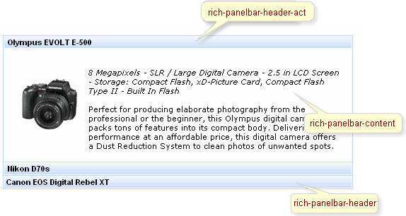
On the screenshot there are classes names that define styles for component elements.
Table 6.233. Classes names that define a component appearance
| Class name | Class description |
|---|---|
| rich-panelbar-header | Defines styles for a wrapper <div> element of a header element |
| rich-panelbar-header-act | Defines styles for a wrapper <div> element of an active header element |
| rich-panelbar-content | Defines styles for a content |
Table 6.234. Style component classes
| A class attribute | A component element defined by an attribute |
|---|---|
| headerClass | Applicable to a header element |
| contentClass | Applicable to a content |
In order to redefine styles for all <rich:panelBarItem> components on a page using CSS, it's enough to create classes with the same names (possible classes could be found in the tables above) and define necessary properties in them.
Example:
...

.rich-panelbar-content{

        background-color: #ecf4fe;

}

...
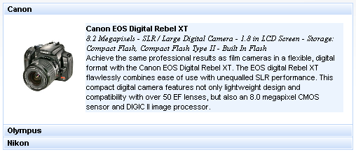
This is a result:
In the example a content background color was changed.
Also it's possible to change styles of particular <rich:panelBarItem> component. In this case you should create own style classes and use them in corresponding <rich:panelBarItem> styleClass attributes. An example is placed below:
Example:
...

.myClass{

  font-family: monospace;

}

...
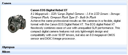
The "headerClass" attribute for <rich:panelBarItem> is defined as it's shown in the example below:
Example:
<rich:panelBarItem ... headerClass="myClass"/>
This is a result:
As it could be seen on the picture above, the font family for header of active item was changed.