Create new RichFaces Documentation Jira issue

This will launch the RichFaces Jira page - to complete your feedback please login if needed, and submit the Jira.
JBoss.orgCommunity Documentation
The <rich:panelMenu> component is used to define an in line vertical menu on a page.
Highly customizable look and feel
Different submission modes
Collapsing/expanding sublevels with optional request sending
Custom and predefined icons support
Disablement support
Table 6.235. rich : panelMenu attributes
| Attribute Name |
Description

|
|---|---|
| binding | JSF: The attribute takes a value-binding expression for a component property of a backing bean |
| converter | JSF: Id of Converter to be used or reference to a Converter |
| converterMessage | A ValueExpression enabled attribute that, if present, will be used as the text of the converter message, replacing any message that comes from the converter |
| disabled | HTML: If true sets state of the item to disabled state. Default value is "false". |
| disabledGroupClass | Assigns one or more space-separated CSS class names to the component disabled groups |
| disabledGroupStyle | CSS style rules to be applied to the component disabled groups |
| disabledItemClass | Assigns one or more space-separated CSS class names to the component disabled items |
| disabledItemStyle | CSS style rules to be applied to the component disabled items |
| event | Defines the event on the representation element that triggers the submenu's expand/collapse. Default value is "onclick". |
| expandMode | Set the submission mode for all panel menu groups after expand/collapse except ones where this attribute redefined. Possible values are "ajax", "server", "none". Default value is "none". |
| expandSingle | Whether only one panel menu node on top level can be opened at a time. If the value of this attribute is true, the previously opened node on the top level is closed. If the value is false, the node is left opened. Default value is "false". |
| groupClass | Assigns one or more space-separated CSS class names to any component group except top groups |
| groupStyle | CSS style rules to be applied to any component group except top groups |
| hoveredGroupClass | Assigns one or more space-separated CSS class names to the component hovered group |
| hoveredGroupStyle | CSS style rules to be applied to the component hovered group |
| hoveredItemClass | Assigns one or more space-separated CSS class names to the component hovered item |
| hoveredItemStyle | CSS style rules to be applied to the component hovered item |
| iconCollapsedGroup | Path to the icon to be displayed for the collapsed Group state. You can also use predefined icons, setting the attribute to one of these possible values: "triangle", "triangleUp", "triangleDown", "disc", "chevron", "chevronUp", "chevronDown", "grid". Default value is "grid". |
| iconCollapsedTopGroup | Path to the icon to be displayed for the collapsed top group state.\ You can also use predefined icons, setting the attribute to one of these possible values: "triangle", "triangleUp", "triangleDown", "disc", "chevron", "chevronUp", "chevronDown", "grid". Default value is "grid". |
| iconDisabledGroup | Path to the icon to be displayed for the disabled group state. You can also use predefined icons, setting the attribute to one of these possible values: "triangle", "triangleUp", "triangleDown", "disc", "chevron", "chevronUp", "chevronDown", "grid". Default value is "grid". |
| iconDisabledItem | Path to the icon to be displayed for the disabled item state. You can also use predefined icons, setting the attribute to one of these possible values: "triangle", "triangleUp", "triangleDown", "disc", "chevron", "chevronUp", "chevronDown", "grid". Default value is "grid". |
| iconExpandedGroup | Path to the icon to be displayed for the expanded Group state. You can also use predefined icons, setting the attribute to one of these possible values: "triangle", "triangleUp", "triangleDown", "disc", "chevron", "chevronUp", "chevronDown", "grid". Default value is "grid". |
| iconExpandedTopGroup | Path to the icon to be displayed for the expanded top group state. You can also use predefined icons, setting the attribute to one of these possible values: "triangle", "triangleUp", "triangleDown", "disc", "chevron", "chevronUp", "chevronDown", "grid". Default value is "grid". |
| iconGroupPosition | Position of the icon for the group icon. Possible values are "left","right","none". Default value is "left". |
| iconGroupTopPosition | Position of the icon for the top group icon. Possible values are "left","right","none". Default value is "left". |
| iconItem | Path to the icon to be displayed for the enabled item state. You can also use predefined icons, setting the attribute to one of these possible values: "triangle", "triangleUp", "triangleDown", "disc", "chevron", "chevronUp", "chevronDown", "grid". Default value is "grid". |
| iconItemPosition | Position of the icon for the item icon. Possible values are "left","right","none". Default value is "left". |
| iconItemTopPosition | Position of the icon for the top item icon. Possible values are "left","right","none". Default value is "left". |
| iconTopDisabledItem | Path to the icon to be displayed for the disabled top item state. You can also use predefined icons, setting the attribute to one of these possible values: "triangle", "triangleUp", "triangleDown", "disc", "chevron", "chevronUp", "chevronDown", "grid". Default value is "grid". |
| iconTopDisableGroup | Path to the icon to be displayed for the disabled top Group state. You can also use predefined icons, setting the attribute to one of these possible values: "triangle", "triangleUp", "triangleDown", "disc", "chevron", "chevronUp", "chevronDown", "grid". Default value is "grid". |
| iconTopItem | Path to the icon to be displayed for the enabled top item state. You can also use predefined icons, setting the attribute to one of these possible values: "triangle", "triangleUp", "triangleDown", "disc", "chevron", "chevronUp", "chevronDown", "grid". Default value is "grid". |
| id | JSF: Every component may have a unique id that is automatically created if omitted |
| immediate | A flag indicating that this component value must be converted and validated immediately (that is, during Apply Request Values phase), rather than waiting until a Process Validations phase |
| itemClass | Assigns one or more space-separated CSS class names to any component item except top items |
| itemStyle | CSS style rules to be applied to the component item except top items |
| label | A localized user presentable name for this component. |
| mode | Set the submission mode for all panel menu items on the panel menu except ones where this attribute redefined. Possible values are "ajax", "server", "server". Default value is "server". |
| onclick | DHTML: The client-side script method to be called when the component is clicked |
| ondblclick | DHTML: HTML: a script expression; a pointer button is double-clicked |
| ongroupcollapse | The client-side script method to be called when some group is closed |
| ongroupexpand | The client-side script method to be called when some group is activated |
| onitemhover | The client-side script method to be called when a panel menu item is hovered |
| onkeydown | DHTML: The client-side script method to be called when a key is pressed down over the element |
| onkeypress | DHTML: The client-side script method to be called when a key is pressed over the element and released |
| onkeyup | DHTML: The client-side script method to be called when a key is released |
| onmousedown | DHTML: The client-side script method to be called when a mouse button is pressed down over the element |
| onmousemove | DHTML: The client-side script method to be called when a pointer is moved within the component |
| onmouseout | DHTML: The client-side script method to be called when a pointer is moved away from the component |
| onmouseover | DHTML: The client-side script method to be called when a pointer is moved onto the component |
| onmouseup | DHTML: The client-side script method to be called when a mouse button is released |
| rendered | JSF: If "false", this component is not rendered |
| required | JSF: If "true", this component is checked for non-empty input |
| requiredMessage | A ValueExpression enabled attribute which defines text of validation message to show, if a required field is missing |
| selectedChild | contain the name or the clientId of any of the item or group, the child defined in this attribute should be highlighted on PanelMenu rendering |
| style | HTML: CSS style rules to be applied to the component |
| styleClass | JSF: Assigns one or more space-separated CSS class names to the component. Corresponds to the HTML "class" attribute. |
| topGroupClass | Assigns one or more space-separated CSS class names to the component top groups |
| topGroupStyle | CSS style rules to be applied to the component top groups |
| topItemClass | Assigns one or more space-separated CSS class names to the component top items |
| topItemStyle | CSS style rules to be applied to the component top items |
| validator | JSF: MethodBinding pointing at a method that is called during Process Validations phase of the request processing lifecycle, to validate the current value of this component |
| validatorMessage | A ValueExpression enabled attribute that, if present, will be used as the text of the validator message, replacing any message that comes from the validator |
| value | JSF: The current value of this component |
| valueChangeListener | JSF: Listener for value changes |
| width | HTML: Set minimal width for the menu. Default value is "100%". |
Table 6.236. Component identification parameters
| Name | Value |
|---|---|
| component-type | org.richfaces.PanelMenu |
| component-class | org.richfaces.component.html.HtmlPanelMenu |
| component-family | org.richfaces.PanelMenu |
| renderer-type | org.richfaces.PanelMenuRenderer |
| tag-class | org.richfaces.taglib.PanelMenuTag |
To create the simplest variant on a page use the following syntax:
Example:
...

<rich:panelMenu event="onmouseover">

        <!--Nested panelMenu components-->

</rich:panelMenu>

...
Example:
import org.richfaces.component.html.HtmlPanelMenu;

...

HtmlPanelMenu myPanelMenu = new HtmlPanelMenu();

...
All attributes are not required.
Use "event" attribute to define an event for appearance of collapsing/expanding sublevels. Default value is "onclick". An example could be seen below.
Example:
...

<rich:panelMenu event="onmouseover">

        <!--Nested panelMenu components-->

</rich:panelMenu>

...
Switching mode could be chosen with the "mode" attribute for all panelMenu items except ones where this attribute was redefined. By default all items send traditional request.
The "expandMode" attribute defines the submission modes for all collapsing/expanding panelMenu groups except ones where this attribute was redefined.
The "mode" and "expandMode" attributes could be used with three possible parameters. The "mode" attribute defines parameters for all included <rich:panelMenuItem> elements.
Server (default)
The common submission of the form is performed and a page is completely refreshed.
Example:
...

<rich:panelMenu mode="server">

        <rich:panelMenuGroup label="test Group" action="#{bean.action}">

                <rich:panelMenuItem label="test" action="#{capitalsBean.action}">

                    <f:param value="test value" name="test"/>

                </rich:panelMenuItem>

        </rich:panelMenuGroup>

</rich:panelMenu>

...
Ajax
An Ajax form submission is performed, and additionally specified elements in the "reRender" attribute are reRendered.
Example:
...

<rich:panelMenu mode="ajax">

        <rich:panelMenuGroup label="test Group" action="#{bean.action}">

                <rich:panelMenuItem label="test" reRender="test" action="#{capitalsBean.action}">

                        <f:param value="test value" name="test"/>

                </rich:panelMenuItem>

        </rich:panelMenuGroup>

</rich:panelMenu>

...
None
"Action" and "ActionListener" item's attributes are ignored. Items don't fire any submits itself. Behavior is fully defined by the components nested into items.
Example:
...

<rich:panelMenu event="onclick" submitMode="none">

        <rich:panelMenuItem label="Link to external page">

                <h:outputLink ... >

        <rich:panelMenuItem>

</rich:panelMenu>

...
As the <rich:panelMenu> component doesn't provide its own form, use it between <h:form> and </h:form> tags.
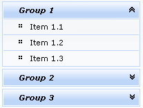
The "expandSingle" attribute is defined for expanding more than one submenu on the same level. The default value is "false" . If it's true the previously opened group on the top level closes before opening another one. See the picture below.
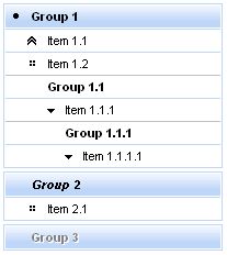
The "selectedChild" attribute is used for defining the name of the selected group or item. An example for group is placed below:
Here is an example:
Example:
...

<rich:panelMenu selectedChild="thisChild">

        <rich:panelMenuGroup label="Group1" name="thisChild">

                <!--Nested panelMenu components-->

        </rich:panelMenuGroup>

</rich:panelMenu>

...
The
"label"
attribute is a generic attribute.
The
"label"
attribute provides an association between a component, and the message that the component (indirectly) produced.
This attribute defines the parameters of localized error and informational messages that
occur as a result of conversion, validation, or other application actions during the request
processing lifecycle. With the help of this attribute you can replace the
last parameter substitution token shown in the messages. For example, {1} for "DoubleRangeValidator.MAXIMUM", {2}
for "ShortConverter.SHORT".
In Java Script code for expanding/collapsing group element creation it's
necessary to use expand()/collapse() function.
Table 6.237. JavaScript API
| Function | Description |
|---|---|
| expand() | Expands group element |
| collapse() | Collapses group element |
For skinnability implementation, the components use a style class redefinition method.
There are no skin parameters. To redefine the appearance of all <rich:panelMenu> components at once, you should add to your style sheets the style class used by a <rich:panelMenu> component.
Table 6.238. Classes names that define a component appearance
| Class name | Class description |
|---|---|
| rich-pmenu | Defines styles for a wrapper <div> element of a component |
| rich-pmenu-top-group | Defines styles for a top group element of a component |
In order to redefine styles for all <rich:panelMenu> components on a page using CSS, it's enough to create classes with the same names (possible classes could be found in the tables above) and define necessary properties in them.
Example:
...

.rich-pmenu{

    font-style:italic;

}

...
This is a result:
In the example the font style was changed.
Also it's possible to change styles of particular <rich:panelMenu> component. In this case you should create own style classes and use them in corresponding <rich:panelMenu> styleClass attributes. An example is placed below:
Example:
...

.myClass{

    background-color: #ecf4fe;

}

...
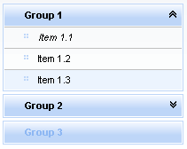
The "hoveredItemClass" attribute for <rich:panelMenu> is defined as it's shown in the example below:
Example:
<rich:panelMenu ... hoveredItemClass="myClass"/>
This is a result:
As it could be seen on the picture above,background color for hovered item was changed.
On the component LiveDemo page you can see the example of <rich:panelMenu> usage and sources for the given example.