Create new RichFaces Documentation Jira issue

This will launch the RichFaces Jira page - to complete your feedback please login if needed, and submit the Jira.
JBoss.orgCommunity Documentation
The <rich:panelMenuGroup> component is used to define an expandable group of items inside the panel menu or other group.
Highly customizable look-and-feel
Different submission modes inside every group
Optional submissions on expand collapse groups
Custom and predefined icons supported
Support for disabling
Table 6.239. rich : panelMenuGroup attributes
| Attribute Name |
Description

|
|---|---|
| accesskey | HTML: This attribute assigns an access key to an element. An access key is a single character from the document character set. Note: Authors should consider the input method of the expected reader when specifying an accesskey |
| action | MethodBinding pointing at the application action to be invoked, if this UIComponent is activated by you, during the Apply Request Values or Invoke Application phase of the request processing lifecycle, depending on the value of the immediate property |
| actionListener | MethodBinding pointing at method accepting an ActionEvent with return type void |
| ajaxSingle | Limits JSF tree processing (decoding, conversion, validation and model updating) only to a component that sends the request. Boolean |
| align | Deprecated. This attribute specifies the horizontal alignment of its element with respect to the surrounding context. The possible values are "left", "center", "right" and "justify". The default depends on the base text direction. For left to right text, the default is align="left", while for right to left text, the default is align="right". |
| alt | HTML: For a user agents that cannot display images, forms, or applets, this attribute specifies alternate text. The language of the alternate text is specified by the lang attribute |
| binding | JSF: The attribute takes a value-binding expression for a component property of a backing bean |
| bypassUpdates | If "true", after process validations phase it skips updates of model beans on a force render response. It can be used for validating components input |
| converter | JSF: Id of Converter to be used or reference to a Converter |
| converterMessage | A ValueExpression enabled attribute that, if present, will be used as the text of the converter message, replacing any message that comes from the converter |
| data | Serialized (on default with JSON) data passed on the client by a developer on AJAX request. It's accessible via "data.foo" syntax |
| disabled | HTML: When set for a form control, this boolean attribute disables the control for your input |
| disabledClass | Assigns one or more space-separated CSS class names to the group disabled items |
| disabledStyle | CSS style rules to be applied to the group disabled items |
| eventsQueue | Name of requests queue to avoid send next request before complete other from same event. Can be used to reduce number of requests of frequently events (key press, mouse move etc.) |
| expanded | If true group will be displayed expanded initially. Default value is "false". |
| expandMode | Set the submission mode for all panel menu groups after expand/collapse except ones where this attribute redefined. Possible value are "ajax", "server", "none". Default value is "none". |
| focus | ID of an element to set focus after request is completed on client side |
| hoverClass | Assigns one or more space-separated CSS class names to the group hovered item |
| hoverStyle | CSS style rules to be applied to the group hovered item |
| iconClass | Assigns one or more space-separated CSS class names to the group icon element |
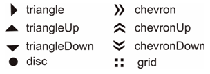
| iconCollapsed | Path to the icon to be displayed for the collapsed item state. You can also use predefined icons, setting the attribute to one of these possible values: "triangle", "triangleUp", "triangleDown", "disc", "chevron", "chevronUp", "chevronDown", "grid". Default value is "grid". |
| iconDisabled | Path to the icon to be displayed for the disabled item state. |
| iconExpanded | Path to the icon to be displayed for the expanded item state. You can also use predefined icons, setting the attribute to one of these possible values: "triangle", "triangleUp", "triangleDown", "disc", "chevron", "chevronUp", "chevronDown", "grid". Default value is "grid". |
| iconStyle | CSS style rules to be applied to the group icon element |
| id | JSF: Every component may have a unique id that is automatically created if omitted |
| ignoreDupResponses | Attribute allows to ignore an Ajax Response produced by a request if the newest 'similar' request is in a queue already. ignoreDupResponses="true" does not cancel the request while it is processed on the server, but just allows to avoid unnecessary updates on the client side if the response isn't actual now |
| immediate | True means, that the default ActionListener should be executed immediately (i.e. during Apply Request Values phase of the request processing lifecycle), rather than waiting until the Invoke Application phase |
| label | Displayed node's text |
| limitToList | If "true", then of all AJAX-rendered on the page components only those will be updated, which ID's are passed to the "reRender" attribute of the describable component. "false"-the default value-means that all components with ajaxRendered="true" will be updated. |
| maxlength | HTML: Specifies the maximum number of digits that could be entered into the input field. The maximum number is unlimited by default. If entered value exceeds the value specified in "maxValue" attribute than the slider takes a maximum value position. |
| onbeforedomupdate | The client-side script method to be called before DOM is updated |
| onclick | DHTML: The client-side script method to be called when the element is clicked |
| oncollapse | The client-side script method to be called when a pane menu group is closed |
| ondblclick | DHTML: The client-side script method to be called when the element is double-clicked |
| onexpand | The client-side script method to be called when a pane menu group is opened |
| onmousedown | DHTML: The client-side script method to be called when a mouse button is pressed down over the element |
| onmousemove | DHTML: The client-side script method to be called when a pointer is moved within the element |
| onmouseout | DHTML: The client-side script method to be called when a pointer is moved away from the element |
| onmouseover | DHTML: The client-side script method to be called when a pointer is moved onto the element |
| onmouseup | DHTML: The client-side script method to be called when a mouse button is released |
| process | Id['s] (in format of call UIComponent.findComponent()) of components, processed at the phases 2-5 in case of AjaxRequest caused by this component. Can be single id, comma-separated list of Id's, or EL Expression with array or Collection |
| rendered | JSF: If "false", this component is not rendered |
| requestDelay | Attribute defines the time (in ms.) that the request will be wait in the queue before it is ready to send. When the delay time is over, the request will be sent to the server or removed if the newest 'similar' request is in a queue already |
| required | JSF: If "true", this component is checked for non-empty input |
| requiredMessage | A ValueExpression enabled attribute which defines text of validation message to show, if a required field is missing |
| reRender | Id['s] (in format of call UIComponent.findComponent()) of components, rendered in case of AjaxRequest caused by this component. Can be single id, comma-separated list of Id's, or EL Expression with array or Collection |
| similarityGroupingId | If there are any component requests with identical IDs then these requests will be grouped. |
| size | HTML: This attribute tells the user agent the initial width of the control. The width is given in pixels except when type attribute has the value "text" or "password". In that case, its value refers to the (integer) number of characters |
| status | ID (in format of call UIComponent.findComponent()) of Request status component |
| style | HTML: CSS style rules to be applied to the component |
| styleClass | JSF: Assigns one or more space-separated CSS class names to the component. Corresponds to the HTML "class" attribute. |
| tabindex | HTML: This attribute specifies the position of the current element in the tabbing order for the current document. This value must be a number between 0 and 32767. User agents should ignore leading zeros |
| target | HTML: Target frame for action to execute. |
| timeout | Response waiting time on a particular request. If a response is not received during this time, the request is aborted |
| validator | JSF: MethodBinding pointing at a method that is called during Process Validations phase of the request processing lifecycle, to validate the current value of this component |
| validatorMessage | A ValueExpression enabled attribute that, if present, will be used as the text of the validator message, replacing any message that comes from the validator |
| value | JSF: The current value for this component |
| valueChangeListener | JSF: Listener for value changes |
Table 6.240. Component identification parameters
| Name | Value |
|---|---|
| component-type | org.richfaces.PanelMenuGroup |
| component-class | org.richfaces.component.html.HtmlPanelMenuGroup |
| component-family | org.richfaces.PanelMenuGroup |
| renderer-type | org.richfaces.PanelMenuGroupRenderer |
| tag-class | org.richfaces.taglib.PanelMenuGroupTag |
To create the simplest variant on a page use the following syntax:
Example:
...

<rich:panelMenu>

        <rich:panelMenuGroup label="Group1">

                <!--Nested panelMenu components-->

        </rich:panelMenuGroup>

</rich:panelMenu>

...
Example:
import org.richfaces.component.html.HtmlPanelMenuGroup;

...

HtmlPanelMenuGroup myPanelMenuGroup = new HtmlPanelMenuGroup();

...
All attributes except "label" are optional. The "label" attribute defines text to be represented.
Switching mode could be chosen with the "expandMode" attribute for the concrete panelMenu group.
The "expandMode" attribute could be used with three possible parameters:
ServerM (default)
Regular form submission request is used.
Ajax
Ajax submission is used for switching.
None
"Action" and "actionListener" attributes are ignored. Items don't fire any submits itself. Behavior is fully defined by the components nested into items.
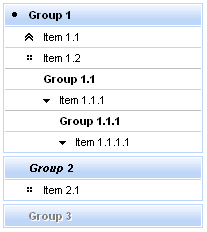
There are three icon-related attributes. The "iconExpanded" attribute defines an icon for an expanded state. The "iconCollapsed" attribute defines an icon for a collapsed state. The "iconDisabled" attribute defines an icon for a disabled state.
Default icons are shown on the picture below:
Here is an example:
Example:
...
<rich:panelMenu>
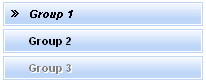
<rich:panelMenuGroup label="Group1" iconExpanded="disc" iconCollapsed="chevron">
<!--Nested panelMenu components-->
</rich:panelMenuGroup>
</rich:panelMenu>
...
As the result the pictures are shown below. The first one represents the collapsed state, the second one - expanded state:
It's also possible to define a path to the icon. Simple code is placed below.
...

<rich:panelMenu>

        <rich:panelMenuGroup label="Group1" iconExpanded="\images\img1.png" iconCollapsed="\images\img2.png">

                    <!--Nested menu components-->

        </rich:panelMenuGroup>

</rich:panelMenu>

...
Information about the "process" attribute usage you can find " Decide what to process " guide section.
In Java Script code for expanding/collapsing group element creation it's
necessary to use expand()/collapse() function.
Table 6.241. JavaScript API
| Function | Description |
|---|---|
| expand() | Expand group element |
| collapse() | Collapse group element |
For skinnability implementation, the components use a style class redefinition method. Default style classes are mapped on skin parameters.
There are two ways to redefine the appearance of all <rich:panelMenuGroup> components at once:
Redefine the corresponding skin parameters
Add to your style sheets style classes used by a <rich:panelMenuGroup> component
Table 6.242. Skin parameters redefinition for a table element of the first level group
| Skin parameters | CSS properties |
|---|---|
| headerWeightFont | font-weight |
| generalFamilyFont | font-family |
| headerSizeFont | font-size |
| headerTextColor | color |
| headerBackgroundColor | background-color |
Table 6.243. Skin parameters redefinition for a table element of second and next level groups
| Skin parameters | CSS properties |
|---|---|
| headerWeightFont | font-weight |
| headerFamilyFont | font-family |
| headerSizeFont | font-size |
| generalTextColor | color |
| tableBorderColor | border-top-color |
Table 6.244. Skin parameters redefinition for wrapper div element of the first level group
| Skin parameters | CSS properties |
|---|---|
| panelBorderColor | border-color |
Table 6.245. Skin parameters redefinition for a hovered group element
| Skin parameters | CSS properties |
|---|---|
| additionalBackgroundColor | background-color |
Table 6.246. Skin parameters redefinition for a disabled group element
| Skin parameters | CSS properties |
|---|---|
| tabDisabledTextColor | color |
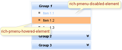
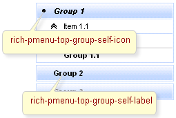
On the screenshot there are classes names that define styles for component elements.
Table 6.247. Classes names that define an upper level groups
| Class name | Description |
|---|---|
| rich-pmenu-top-group-self-icon | Defines styles for a top group icon |
| rich-pmenu-top-group-self-label | Defines styles for a top group label |
Table 6.248. Classes names that define a second and lower level groups
| Class name | Description |
|---|---|
| rich-pmenu-group | Defines styles for a group |
| rich-pmenu-group-self-icon | Defines styles for a group icon |
| rich-pmenu-group-self-label | Defines styles for a group label |
Table 6.249. Classes names that define a group state
| Class name | Description |
|---|---|
| rich-pmenu-hovered-element | Defines styles for a hovered group element |
| rich-pmenu-disabled-element | Defines styles for a disabled group element |
In order to redefine styles for all <rich:panelMenuGroup> components on a page using CSS, it's enough to create classes with the same names (possible classes could be found in the tables above) and define necessary properties in them.
Example:
...

.rich-pmenu-disabled-element{

        color: #87b9ff;

}

...
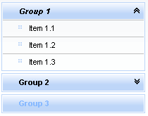
This is a result:
In the example a disabled element font style and color were changed.
Also it's possible to change styles of particular <rich:panelMenuGroup> component. In this case you should create own style classes and use them in corresponding <rich:panelMenuGroup> styleClass attributes. An example is placed below:
Example:
...

.myClass{

       background-color: #ecf4fe;

}

...
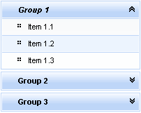
The "hoverClass" attribute for <rich:panelMenuGroup> is defined as it's shown in the example below:
Example:
<rich:panelMenuGroup ... hoverClass="myClass"/>
This is a result:
As it could be seen on the picture above, the background color for hovered item was changed.
Some additional information about usage of component can be found on the component Live Demo page.