Create new RichFaces Documentation Jira issue

This will launch the RichFaces Jira page - to complete your feedback please login if needed, and submit the Jira.
JBoss.orgCommunity Documentation
Fully skinnable tabs content
Disabled/enabled tab options
Groups any content inside a tab
Each tab has a unique name for a direct access (e.g. for switching between tabs)
Switch methods can be easily customized for every tab separately with attribute to:
Server
Client
AJAX
Table 6.288. rich : tab attributes
| Attribute Name |
Description

|
|---|---|
| action | MethodBinding pointing at the application action to be invoked, if this UIComponent is activated by you, during the Apply Request Values or Invoke Application phase of the request processing lifecycle, depending on the value of the immediate property |
| actionListener | MethodBinding pointing at method accepting an ActionEvent with return type void |
| ajaxSingle | Limits JSF tree processing (decoding, conversion, validation and model updating) only to a component that sends the request. Boolean |
| binding | JSF: The attribute takes a value-binding expression for a component property of a backing bean |
| data | Serialized (on default with JSON) data passed on the client by a developer on AJAX request. It's accessible via "data.foo" syntax |
| disabled | HTML: Disables a tab in a tab panel |
| eventsQueue | Name of requests queue to avoid send next request before complete other from same event. Can be used to reduce number of requests of frequently events (key press, mouse move etc.) |
| focus | ID of an element to set focus after request is completed on client side |
| id | JSF: Every component may have a unique id that is automatically created if omitted |
| ignoreDupResponses | Attribute allows to ignore an Ajax Response produced by a request if the newest 'similar' request is in a queue already. ignoreDupResponses="true" does not cancel the request while it is processed on the server, but just allows to avoid unnecessary updates on the client side if the response isn't actual now |
| immediate | True means, that the default ActionListener should be executed immediately (i.e. during Apply Request Values phase of the request processing lifecycle), rather than waiting until the Invoke Application phase |
| label | Text for the actual "tab" in a tab section |
| labelWidth | Length for the actual "tab" in a tab section defined in pixels. If it is not defined, the length is calculated basing on a tab label text length |
| limitToList | If "true", then of all AJAX-rendered on the page components only those will be updated, which ID's are passed to the "reRender" attribute of the describable component. "false"-the default value-means that all components with ajaxRendered="true" will be updated. |
| name | Attribute defines tab name. Default value is "getId()". |
| onbeforedomupdate | The client-side script method to be called before DOM is updated |
| onclick | DHTML: The client-side script method to be called when the element is clicked |
| oncomplete | The client-side script method to be called after the request is completed |
| ondblclick | DHTML: The client-side script method to be called when the element is double-clicked |
| onkeydown | DHTML: The client-side script method to be called when a key is pressed down over the element |
| onkeypress | DHTML: The client-side script method to be called when a key is pressed over the element and released |
| onkeyup | DHTML: The client-side script method to be called when a key is released |
| onlabelclick | The client-side script method to be called when a tab label is clicked |
| onlabeldblclick | The client-side script method to be called when a tab label is double-clicked |
| onlabelkeydown | The client-side script method to be called when a key is pressed down together with the pointer hovered over a tab label |
| onlabelkeypress | The client-side script method to be called when a key is pressed and released together with the pointer hovered over a tab label |
| onlabelkeyup | The client-side script method to be called when a key is released together with the pointer hovered over a tab label |
| onlabelmousedown | The client-side script method to be called when a mouse button is pressed down over a tab label |
| onlabelmousemove | The client-side script method to be called when a pointer is moved within a tab label |
| onlabelmouseup | The client-side script method to be called when a mouse button is released over a tab label |
| onmousedown | DHTML: The client-side script method to be called when a mouse button is pressed down over the element |
| onmousemove | DHTML: The client-side script method to be called when a pointer is moved within the element |
| onmouseout | DHTML: The client-side script method to be called when a pointer is moved away from the element |
| onmouseover | DHTML: The client-side script method to be called when a pointer is moved onto the element |
| onmouseup | DHTML: The client-side script method to be called when a mouse button is released |
| ontabenter | The client-side script method to be called when the tab is switched |
| ontableave | The client-side script method to be called when the tab is left |
| process | Id['s] (in format of call UIComponent.findComponent()) of components, processed at the phases 2-5 in case of AjaxRequest caused by this component. Can be single id, comma-separated list of Id's, or EL Expression with array or Collection |
| rendered | JSF: If "false", this component is not rendered |
| requestDelay | Attribute defines the time (in ms.) that the request will be wait in the queue before it is ready to send. When the delay time is over, the request will be sent to the server or removed if the newest 'similar' request is in a queue already |
| reRender | Id['s] (in format of call UIComponent.findComponent()) of components, rendered in case of AjaxRequest caused by this component. Can be single id, comma-separated list of Id's, or EL Expression with array or Collection |
| similarityGroupingId | If there are any component requests with identical IDs then these requests will be grouped. |
| status | ID (in format of call UIComponent.findComponent()) of Request status component |
| style | HTML: CSS style rules to be applied to the component |
| styleClass | JSF: Assigns one or more CSS class names to the component. Corresponds to the HTML "class" attribute. |
| switchType | Tabs switch mode. Possible values are "client", "server", "ajax", "page". |
| timeout | Response waiting time on a particular request. If a response is not received during this time, the request is aborted |
| title | HTML: HTML: An advisory title for this element. Often displayed as a tooltip |
Table 6.289. Component identification parameters
| Name | Value |
|---|---|
| component-type | org.richfaces.Tab |
| component-class | org.richfaces.component.html.HtmlTab |
| component-family | org.richfaces.Tab |
| renderer-type | org.richfaces.TabRenderer |
| tag-class | org.richfaces.taglib.TabTag |
To create the simplest variant on a page use the following syntax:
Example:
...

<rich:tabPanel>

        <!--Set of Tabs inside-->

        <rich:tab>

                ...

        </rich:tab>

</rich:tabPanel>

...
Example:
import org.richfaces.component.html.HtmlTab;

...

HtmlTab myTab = new HtmlTab();

...
The main component function is to define a content group that is rendered and processed when the tab is active, i.e. click on a tab causes switching onto a tab containing content corresponded to this tab.
The "label" attribute defines text to be represented. If you can use the "label" facet, you can even not use the "label" attribute.
Example:
...

<rich:tab>

        <f:facet name="label">

                <h:graphicImage value="/images/img1.png"/>

        </f:facet>

        ...

        <!--Any Content inside-->

        ...

</rich:tab>

...
A marker on a tab header defined with the "label" attribute. Moreover, each tab could be disabled (switching on this tab is impossible) with the "disable" attribute.
Example:
...
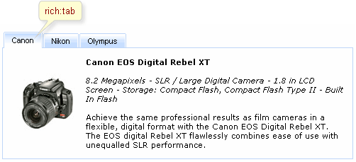
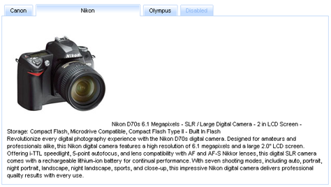
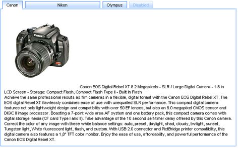
<rich:tabPanel width="20%">
<tabs:tab label="Canon">
<h:outputText value="Canon EOS Digital Rebel XT" />
...
</tabs:tab>
<tabs:tab label="Nikon">
<h:outputText value="Nikon D70s" />
...
</tabs:tab>
<tabs:tab label="Olympus">
<h:outputText value="Olympus EVOLT E-500" />
...
</tabs:tab>
<tabs:tab disabled="true" name="disabled" label="Disabled"/>
</rich:tabPanel>
...
With this example it's possible to generate the tab panel with the last disabled and three active tabs (see the picture).
Switching mode could be defined not only for the whole panel tab, but also for each particular tab, i.e. switching onto one tab could be performed right on the client with the corresponding JavaScript and onto another tab with an Ajax request on the server. Tab switching modes are the same as tabPanel ones.
Each tab also has an attribute name (alias for "id" attribute). Using this attribute value it's possible e.g. to set an active tab on a model level specifying this name in the corresponding attribute of the whole tab.
Except the specific component attributes it has all necessary attributes for JavaScript event definition.
"onmouseover"
"onmouseout"
etc.
Some event could be performed on the tab which has been entered/left using "ontabenter" / "ontableave" attributes. See the example below.
Example:
...

<rich:tabPanel>

        <rich:tab label="Tab1" ontabenter="alert()">

                ...

        </rich:tab>

       ...

</rich:tabPanel>

...
The following example shows how on the client side to get the names of
entered/left tabs.
ontabenter="alert(leftTabName)"
Information about the "process" attribute usage you can find in the "Decide what to process" guide section.
For skinnability implementation, the components use a style class redefinition method. Default style classes are mapped on skin parameters.
A panel appearance and content is defined with a tab panel i.e. on the tab level it's possible to define only an appearance of this tab header.
There are two ways to redefine the appearance of all <rich:tab> components at once:
Redefine the corresponding skin parameters
Add to your style sheets style classes used by a <rich:tab> component
Table 6.291. Skin parameters redefinition for a tab header
| Skin parameters | CSS properties |
|---|---|
| generalTextColor | color |
| generalSizeFont | font-size |
| generalFamilyFont | font-family |
Table 6.292. Skin parameters redefinition for an active tab
| Skin parameters | CSS properties |
|---|---|
| generalTextColor | color |
| subBorderColor | border-color |
| generalBackgroundColor | background-color |
Table 6.293. Skin parameters redefinition for an inactive tab
| Skin parameters | CSS properties |
|---|---|
| tabBackgroundColor | background-color |
| subBorderColor | border-color |
Table 6.294. Skin parameters redefinition for a disabled tab
| Skin parameters | CSS properties |
|---|---|
| tabBackgroundColor | background-color |
| subBorderColor | border-color |
| tabDisabledTextColor | color |
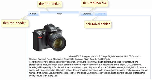
Table 6.295. Classes names that define a tab
| Class name | Description |
|---|---|
| rich-tab-header | Defines styles for a tab header |
| rich-tab-label | Defines styles for a tab label |
Table 6.296. Classes names that define a tab states
| Class name | Description |
|---|---|
| rich-tab-active | Defines styles for an active tab |
| rich-tab-inactive | Defines styles for an inactive tab |
| rich-tab-disabled | Defines styles for a disabled tab |
In order to redefine styles for all <rich:tab> components on a page using CSS, it's enough to create classes with the same names (possible classes could be found in the tables above) and define necessary properties in them.
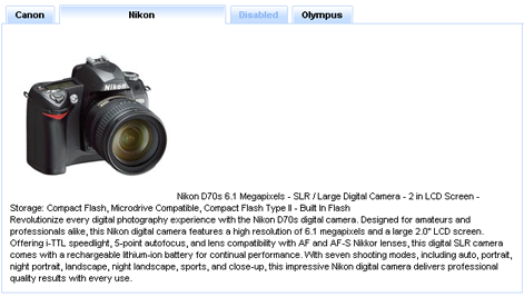
Example:
...

.rich-tab-header{

        font-weight: bold;

}

...
This is a result:
In the example a header font weight was changed.
Also it's possible to change styles of particular <rich:tab> component. In this case you should create own style classes and use them in corresponding <rich:tab> styleClass attributes. An example is placed below:
Example:
...

.myClass{

        border-color: #5d9ffc;

}

...
The "styleClass" attribute for <rich:tab> is defined as it's shown in the example below:
Example:
<rich:tab ... styleClass="myClass"/>
This is a result:
As it could be seen on the picture above, the border color was changed.