Create new RichFaces Documentation Jira issue

This will launch the RichFaces Jira page - to complete your feedback please login if needed, and submit the Jira.
JBoss.orgCommunity Documentation
A wrapper component with named facets, where every facet is shown after activation of the corresponding toggleControl (the other is hidden).
Support for any content inside
Three modes of facets switching
Server
Client
Ajax
Controls for togglePanel can be everywhere in layout
Table 6.297. rich : togglePanel attributes
| Attribute Name |
Description

|
|---|---|
| binding | JSF: The attribute takes a value-binding expression for a component property of a backing bean |
| converter | JSF: Id of Converter to be used or reference to a Converter |
| converterMessage | A ValueExpression enabled attribute that, if present, will be used as the text of the converter message, replacing any message that comes from the converter |
| id | JSF: Every component may have a unique id that is automatically created if omitted |
| immediate | A flag indicating that this component value must be converted and validated immediately (that is, during Apply Request Values phase), rather than waiting until a Process Validations phase |
| initialState | It contains a name of the first active facet |
| label | A localized user presentable name for this component. |
| onclick | DHTML: The client-side script method to be called when the element is clicked |
| ondblclick | DHTML: The client-side script method to be called when the element is double-clicked |
| onkeydown | DHTML: The client-side script method to be called when a key is pressed down over the element |
| onkeypress | DHTML: The client-side script method to be called when a key is pressed over the element and released |
| onkeyup | DHTML: The client-side script method to be called when a key is released |
| onmousedown | DHTML: The client-side script method to be called when a mouse button is pressed down over the element |
| onmousemove | DHTML: The client-side script method to be called when a pointer is moved within the element |
| onmouseout | DHTML: The client-side script method to be called when a pointer is moved away from the element |
| onmouseover | DHTML: The client-side script method to be called when a pointer is moved onto the element |
| onmouseup | DHTML: The client-side script method to be called when a mouse button is released |
| rendered | JSF: If "false", this component is not rendered |
| stateOrder | Names of the facets in the switching order. If ToggleControl doesn't contain information about a next facet to be shown it is switched corresponding to this attribute |
| style | HTML: CSS style rules to be applied to the component |
| styleClass | JSF: Assigns one or more CSS class names to the component. Corresponds to the HTML "class" attribute. |
| switchType | Facets switch mode: "client", "server"(default), "ajax". |
| validator | JSF: MethodBinding pointing at a method that is called during Process Validations phase of the request processing lifecycle, to validate the current value of this component |
| validatorMessage | A ValueExpression enabled attribute that, if present, will be used as the text of the validator message, replacing any message that comes from the validator |
| value | JSF: The initial value to set when rendered for the first time. It contains information about an active facet |
| valueChangeListener | JSF: Listener for value changes |
Table 6.298. Component identification parameters
| Name | Value |
|---|---|
| component-type | org.richfaces.TogglePanel |
| component-class | org.richfaces.component.html.HtmlTogglePanel |
| component-family | org.richfaces.TogglePanel |
| renderer-type | org.richfaces.TogglePanelRenderer |
| tag-class | org.richfaces.Taglib.togglePanelTag |
Here is a simple example as it could be used in a page:
Example:
...

<rich:togglePanel>

        <f:facet name="first">

                ...

        </f:facet>

        <f:facet name="second">

                ...

        </f:facet>

        ...

</rich:togglePanel>

...

<!--Set of the toggleControls somewhere on a page-->

...
Example:
import org.richfaces.component.html.HtmltogglePanel;

...

HtmltogglePanel myPanel = new HtmltogglePanel();

...
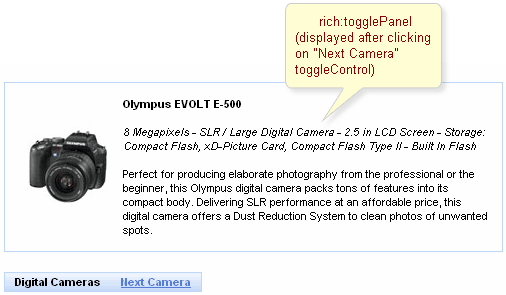
As it was mentioned above, togglePanel splits content into named facets that become rendered and processed when a click performed on controls linked to this togglePanel (either switched on the client or send requests on the server for switching).
The initial component state is defined with "initialState" attribute, where a facet name that is shown at first is defined.
It's also possible to define an "empty" facet to implement the functionality as drop-down panels have and make the facet active when no content is required to be rendered.
Switching mode could be defined with the "switchType" attribute with three possible parameters:
Server (DEFAULT)
The common submission is performed around togglePanel and a page is completely rendered on a called panel. Only one at a time the panel is uploaded onto the client side.
Ajax
AJAX form submission is performed around the panel, content of the called panel is uploaded on an Ajax request . Only one at a time the panel is uploaded on the client side.
Client
All panels are uploaded on the client side. The switching from the active to the hidden panel is performed with client JavaScript.
"Facets" switching order could be defined on the side of <rich:toggleControl> component or on the panel. On the side of the togglePanel it's possible to define facets switching order with the "stateOrder" attribute. The facets names are enumerated in such an order that they are rendered when a control is clicked, as it's not defined where to switch beforehand.
Example:
...

<rich:togglePanel id="panel" initialState="panelB" switchType="client"

                        stateOrder="panelA,panelB,panelC">

        <f:facet name="panelA">

                ...

        </f:facet>

        <f:facet name="panelB">

                ...

        </f:facet>

        <f:facet name="panelC">

                ...

        </f:facet>

</rich:togglePanel>

<rich:toggleControl for="panel" value="Switch"/>

...
The example shows a togglePanel initial state when
the second facet (panelB) is rendered and successive
switching from the first to the second happens.
The
"label"
attribute is a generic attribute. The
"label"
attribute provides an association between a component, and
the message that the component (indirectly) produced. This attribute
defines the parameters of localized error and informational messages
that occur as a result of conversion, validation, or other application
actions during the request processing lifecycle. With the help of this
attribute you can replace the last parameter substitution token shown
in the messages. For example, {1} for
"DoubleRangeValidator.MAXIMUM",
{2} for "ShortConverter.SHORT".
The component doesn't have its own representation rendering only content of its facets, thus all look and feel is set only for content.
Table 6.299. Classes names that define a component appearance
| Class name | Description |
|---|---|
| rich-toggle-panel | Defines styles for all component |
| rich-tglctrl | Defines styles for a toggle control |
In order to redefine styles for all <rich:togglePanel> components on a page using CSS, it's enough to create classes with the same names (possible classes could be found in the tables above) and define necessary properties in them.
Example:
...

.rich-toggle-panel{

    font-style:italic;

}

...
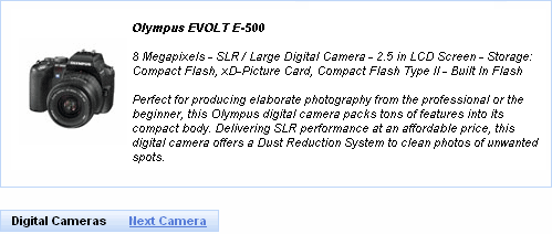
This is a result:
In the example the font style for output text was changed.
Also it's possible to change styles of particular <rich:togglePanel> component. In this case you should create own style classes and use them in corresponding <rich:togglePanel> styleClass attributes. An example is placed below:
Example:
...

.myClass{

    background-color:#bed6f8;

}

...
The "styleClass" attribute for <rich:togglePanel> is defined as it's shown in the example below:
Example:
<rich:togglePanel ... styleClass="myClass"/>
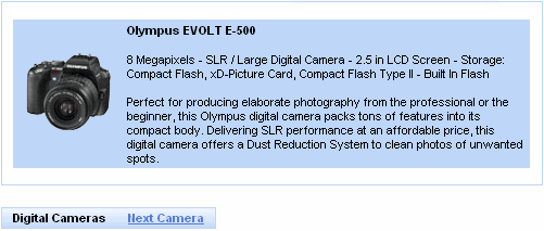
This is a result:
As it could be seen on the picture above, background color for panel was changed.
On the component LiveDemo page you can see the example of <rich:togglePanel> usage and sources for the given example.